Published on
June 8, 2026


Tired of spending days on outdated financial reports? Automated FP&A dashboards can change that by delivering real-time financial insights to help leadership make quicker, informed decisions. Here's what you need to know:
Automated dashboards save time, reduce errors, and shift focus to actionable insights. The result? Teams can stop asking, “Is this data current?” and start asking, “What should we do next?”
An effective FP&A dashboard is like a well-oiled machine - each part must work seamlessly together. Without the right structure, even the most visually impressive dashboard can fall short if it’s built on shaky data.
An FP&A dashboard has four essential layers:
As FP&A expert Asif Masani explains:
"Data that lives in disconnected systems gets manually stitched together in spreadsheets before anyone can see it." [1]
Skipping any of these layers risks undermining the dashboard’s functionality and reliability.
Once the structure is in place, the next priority is data quality. A dashboard is only as reliable as the data feeding into it. One common misstep? Jumping straight to creating dashboards without first fixing data pipelines. A visually appealing dashboard based on flawed data can lead to misguided decisions.
The ultimate goal here is a single source of truth. Whether it’s a high-level executive summary or a detailed transaction report, the numbers must align perfectly. Achieving this requires centralizing data from all source systems into a structured data warehouse and reconciling every metric back to the general ledger. Live connections replace manual exports, ensuring dashboards show real-time data.
Another key feature is drill-down architecture. This allows users to click on a high-level metric, like total revenue, and trace it directly to the individual transactions behind it - all within the same dashboard. This transparency eliminates the need for back-and-forth queries between departments.
Once your data is clean and centralized, the focus shifts to creating visualizations that deliver actionable insights. The aim is to present accurate data in a way that’s tailored to the audience, enabling faster and better decisions.
As Asif Masani puts it:
"The foundation of all good FP&A reporting design is a single question: Who is consuming this, and what decision needs to be taken?" [1]
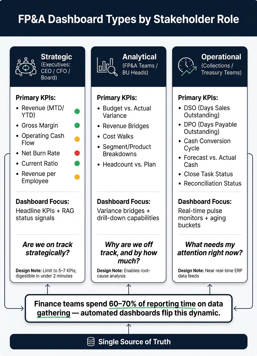
Here’s how different types of dashboards cater to specific audiences:
| Dashboard Type | Primary Audience | Visualization Focus | Key Question Addressed |
|---|---|---|---|
| Strategic | CEO, CFO, Board | Headline KPIs, RAG status signals | Are we on track strategically? |
| Analytical | FP&A, BU Heads | Variance bridges, drill-downs | Why are we off track, and by how much? |
| Operational | Collections, Treasury | Real-time pulse monitors, aging buckets | What needs my attention right now? |
Strategic dashboards should be quick to digest - executives need to grasp the big picture in under two minutes. Limit these views to 5–7 headline KPIs with Red/Amber/Green (RAG) indicators for clarity. Analytical dashboards, on the other hand, should include tools like revenue bridges and cost walks to explain variances in detail. For operational teams, focus on real-time metrics like live cash positions or accounts receivable aging.
Consistency is key across all dashboards. Use standard formatting, such as USD currency symbols, MM/DD/YYYY date formats, and clearly labeled axes. This removes ambiguity, builds trust in the data, and ensures everyone is on the same page.
FP&A Dashboard Types: KPIs & Purpose by Stakeholder Role
Automated dashboards solve the problem of manual inefficiencies, but tailoring them to specific audiences is what ensures clarity and alignment in how data is understood. A one-size-fits-all approach often leads to confusion, as different stakeholders have distinct priorities. For instance, a Fractional CFO might need a quick snapshot of the organization’s overall health, a department head might be focused on understanding the drivers behind performance changes, and an FP&A analyst may require detailed data to ensure accurate financial reporting. Each of these needs demands a unique dashboard design.
Choosing the right KPIs is less about what to include and more about what to leave out. The goal is to focus on metrics that directly inform decisions. To make a metric meaningful, it should always include three elements: a comparison (e.g., against budget or the previous period), a trend line (spanning 6–12 months), and a clear target. A standalone number lacks context, which makes it less actionable.
| Audience | Primary KPIs | Purpose |
|---|---|---|
| Executives (CEO/CFO/Board) | Revenue (MTD/YTD), Gross Margin, Operating Cash Flow, Net Burn Rate, Current Ratio, Revenue per Employee | Strategic oversight and organizational health [2] |
| Department Leaders (BU Heads) | Budget vs. Actual Variance, Revenue Bridges, Cost Walks, Segment/Product Breakdowns, Headcount vs. Plan | Understanding performance drivers and accountability [1][2] |
| Finance Teams (FP&A/Accounting) | DSO, DPO, Cash Conversion Cycle, Forecast vs. Actual Cash, Close Task Status, Reconciliation Status | Operational efficiency and forecasting accuracy [2] |
By selecting KPIs tailored to these roles, dashboards can provide the insights that each stakeholder needs most.
Strategic dashboards should deliver a clear snapshot of overall status in just a few seconds. This means placing headline KPIs at the top, trend lines in the middle, and detailed tables at the bottom [2]. Keep these views concise, limiting them to 5–7 metrics, and use clear visual signals like Red/Amber/Green status indicators. Overloading a dashboard with too much information dilutes its effectiveness.
For department leaders, dashboards should go beyond surface-level numbers to provide context. Tools like budget-vs.-actual variance tables, cost walks, and segment breakdowns help leaders identify what’s driving the numbers and take corrective action. Meanwhile, finance teams benefit from dashboards that prioritize real-time operational data, such as days sales outstanding (DSO) and cash conversion cycles. These teams need precision and up-to-date information, not unnecessary visual flair.
"The best [finance teams] have moved away from static spreadsheet reports entirely and towards connected, live dashboards that serve three distinct audiences with distinct purposes built on a single source of truth, not a patchwork of manual exports." - Asif Masani, FP&A Professional [1]
While dashboards should be customized for different roles, consistency in metrics is key. Even the most well-designed dashboard can create confusion if, for example, "Revenue" is defined one way for the CFO and differently for the sales team. This is why a data dictionary is essential. It serves as a centralized reference that defines each metric, its formula, data source, and interpretation.
Consistency also extends to visual standards. Use a universal color scheme: Green for on track, Amber for areas requiring attention, Red for urgent issues, and Gray for historical comparisons [3]. When everyone interprets metrics and visuals the same way, it not only improves clarity but also builds trust in the data.
Before diving into automation, take a moment to evaluate how your team currently handles financial reporting. Many finance teams spend the bulk of their time manually collecting data, leaving little room for meaningful analysis. This imbalance is the key issue that automation aims to address.
Start by identifying all your data sources - whether it's your ERP, CRM, HRIS, or even spreadsheets. Then ask yourself: How outdated is the data by the time it reaches leadership? In manual workflows, financial data is often already five or more days old by the time it informs decisions [1]. Once you've pinpointed these inefficiencies, consider what each stakeholder needs from the dashboard. For instance, the Board might focus on "Are we on track?" Department heads could ask, "Why are we off track?" Operational teams, on the other hand, may need answers to "What requires immediate attention?" [1].
With these gaps and needs clearly outlined, you can proceed to a phased approach for implementing your automated dashboard.
Phased implementation is the smartest way to roll out a dashboard. Begin by centralizing your data sources. Integrate your ERP, CRM, and HRIS into a unified data warehouse. This eliminates the tedious cycle of manual data exports and ensures you have a single source of truth [1].
Once your data is centralized, build your dashboards in layers to address the different needs of stakeholders. Start with strategic dashboards that focus on 5–7 key performance indicators (KPIs). Next, add analytical dashboards with drill-down capabilities, so users can dig deeper without needing manual reconciliations. Finally, incorporate automated scenario management, replacing those endless spreadsheet tabs with a streamlined interface where users can toggle between Actual, Plan, and Forecast views [1].
A centralized data system is only as good as its governance. Implement role-based access controls right from the start. For example, strategic dashboards for the Board and CFO should highlight high-level KPIs but avoid showing transaction-level details. Meanwhile, analytical dashboards for budget owners should allow drill-down access to explore variances. Operational dashboards, such as those used by treasury or collections teams, require near real-time updates directly from the ERP system [1].
One often overlooked but critical feature of a well-automated system is a built-in audit trail. When you can trace the top-line number on a waterfall chart directly to the transaction list below - without needing external reconciliation - the data speaks for itself. This kind of transparency builds trust. Pair that with a clear data dictionary, and your system will be ready to scale alongside your organization. For companies navigating this transition, Phoenix Strategy Group offers specialized support in building connected and governed financial infrastructures.
When paired with strong governance and a solid data infrastructure, an automated FP&A dashboard can truly shine. One standout feature is the ability to conduct live scenario analysis directly within the dashboard - no need to juggle separate spreadsheets. Advanced dashboards let users seamlessly switch between scenarios like Actual, Plan, Forecast, and Best-Case using a simple dropdown menu. As soon as a scenario is selected, key metrics like COGS, Gross Margin, and Net Revenue update instantly [1]. This functionality empowers CFOs to answer "what if" questions on the fly, toggling between scenarios in real time to make informed decisions.
The integration of AI takes FP&A dashboards to the next level, transforming them from static reporting tools into dynamic decision-making engines. Imagine a finance leader typing a query like "simulate a 10% market volume growth" and instantly receiving an AI-driven, model-based answer [1]. AI also simplifies variance analysis by automatically identifying and calculating variance drivers based on the underlying model. As Asif Masani, an FP&A professional, explains:
"The model replaces manual analysis." [1]
This shift allows analysts to focus their energy on interpreting data and crafting actionable insights, rather than spending time piecing together raw numbers. With predictive analytics in place, your dashboard can adapt to the ever-changing demands of the business landscape.
The power of real-time scenario analysis and AI-driven insights is just the beginning. To stay relevant, your dashboard should evolve alongside your business priorities. Think of it as a living, breathing product - not a one-and-done project. A great litmus test for its effectiveness is how often leadership questions the data’s accuracy. When the numbers are live and reliable, conversations naturally pivot from validating data to making decisive moves.
For expert guidance in fine-tuning your FP&A dashboards, check out Phoenix Strategy Group.
The main goal of an automated FP&A dashboard is straightforward: spend less time assembling data and more time using it to make impactful decisions. Studies reveal that finance teams dedicate 60–70% of their reporting time to gathering and formatting data, leaving less than 30% for the kind of in-depth analysis that truly drives results [1]. Automation flips this dynamic, allowing teams to focus on what matters most. This shift is crucial for staying competitive.
For companies in growth stages, the need is even greater. A connected dashboard that provides real-time, unified data ensures every variance is traceable, and every "what if" question can be answered on the spot.
As one FP&A expert put it:
"When the numbers are live, leadership stops asking 'is this current?' and starts asking 'what do we do about this?'" [1]
In the end, a dependable dashboard transforms decision-making, enabling it to be quicker and more confident by replacing outdated data with timely, actionable insights.
If you're looking to upgrade your FP&A systems, Phoenix Strategy Group works with growth-stage companies to build financial systems that deliver this clarity. Their services include FP&A dashboards, data engineering, and fractional CFO support designed to meet your needs.
The time it takes to roll out an FP&A dashboard varies based on the platform and the complexity of integrations. For straightforward, automated tools, it might take as little as an hour. On the other hand, enterprise-level solutions can require several months to implement. Phoenix Strategy Group specializes in providing expert support in data engineering and financial analysis, helping growth-stage companies simplify this process and create reporting systems that are both efficient and scalable to meet their specific needs.
To get started, focus on centralizing your accounting system - options like QuickBooks or NetSuite work well as the core source for all financial records. Once that's in place, connect essential systems to it. This includes your CRM platform to track revenue, banking records to monitor cash flow, payroll systems to account for labor costs, and any operational spreadsheets you rely on.
Organizations like Phoenix Strategy Group assist growth-stage companies in mapping and integrating these systems. Their goal? To create consistent data structures that support accurate reporting and smarter strategic decisions.
To keep KPIs aligned, it's crucial to maintain consistent metric definitions - such as a standardized way to calculate revenue - across dashboards used by finance, sales, and executives. Automated workflows can help by applying uniform rules and formulas during data processing, cutting down on manual discrepancies. A centralized data structure ensures every team works from verified, consistent information. This not only builds trust in the data but also allows teams to concentrate on strategic decisions instead of spending time verifying numbers.