Published on
October 31, 2025

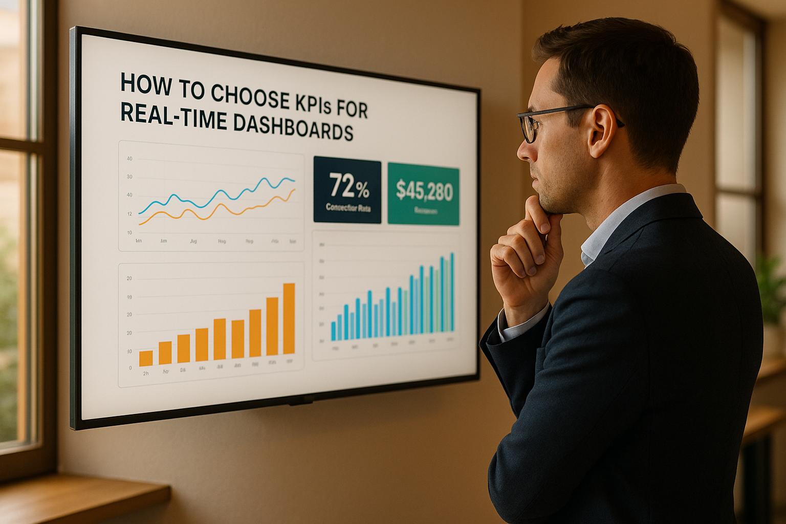
Choosing the right KPIs for your real-time dashboard is critical to making fast, informed decisions that align with your business goals. The wrong metrics can create noise, while the right ones can drive action and improve performance. Here's a quick summary of how to get it right:
To choose the right KPIs for your dashboard, you first need to clearly define your business objectives. Without this clarity, your dashboard risks becoming cluttered and ineffective. The goal is simple: align your business priorities with the metrics your dashboard tracks. This connection ensures your dashboard not only measures progress but also drives meaningful action.
For growth-stage companies, success often hinges on five key areas: cash flow management, fundraising readiness, scaling operations, customer acquisition, and profitability improvement. Your dashboard should zero in on the areas most relevant to your current stage of growth.
For example:
These metrics provide real-time insights, helping you make informed decisions quickly - especially when demand increases or challenges arise.
A great way to document your goals is by using the SMART framework (Specific, Measurable, Achievable, Relevant, Time-Bound). For instance, instead of a vague goal like "improve sales", aim for something more specific, like "increase monthly sales by 15% within the next quarter." This level of detail makes it easier to choose KPIs that directly support your objectives while ensuring every metric on your dashboard has a clear purpose.
The effectiveness of your dashboard depends on how well it serves its intended audience. Different teams and roles within your organization have unique needs, so your KPI selection should reflect those differences.
| Audience Type | Dashboard Focus | Example KPIs |
|---|---|---|
| Executives | High-level summaries | Revenue, EBITDA, Cash Flow |
| Finance Teams | Financial health, compliance | Accounts Receivable, Burn Rate |
| Operational Managers | Day-to-day operations | Inventory Turnover, Production Rate |
Executives need a bird's-eye view of the company's health. Their dashboards should highlight key metrics like revenue growth, EBITDA, and cash runway. These summaries should be visually clear, offering quick insights without overwhelming detail.
Finance teams, on the other hand, dive deeper into the numbers. They track accounts receivable aging, cash flow forecasts, and expense ratios to ensure financial stability and compliance. Their dashboards should provide granular data and historical trends for thorough analysis.
Operational managers focus on the nuts and bolts of daily operations. They rely on real-time data for metrics like production rates, inventory levels, and team performance. Their dashboards should help them spot issues quickly and take immediate action.
To make your dashboard indispensable, involve each audience in its design. Ask them what decisions they make daily, what data would make those decisions easier, and how they prefer to view that information. Tailoring your dashboard in this way ensures it becomes a vital tool for every stakeholder.
The real power of a dashboard lies in its ability to provide actionable insights. Every KPI should do more than just report data - it should highlight opportunities for action when trends shift or thresholds are breached.
Real-time reporting is especially valuable when it enables immediate responses. For instance, if your dashboard shows a sudden increase in customer churn, you should already have a plan ready - whether that’s launching a retention campaign, investigating potential issues, or reaching out to at-risk customers.
Phoenix Strategy Group specializes in helping organizations align dashboard goals with their financial and strategic priorities. Their approach focuses on identifying the data points that directly impact business outcomes, ensuring those metrics are monitored in real time.
Think about how your objectives translate into daily, weekly, and monthly actions. For example, if you're preparing for a funding round, your dashboard should track metrics like monthly recurring revenue (MRR), customer acquisition cost (CAC), lifetime value (LTV), and burn rate. Alerts should notify you when any of these metrics move outside acceptable ranges, allowing you to act quickly.
An effective dashboard breaks down high-level goals into measurable targets that guide your daily actions. It becomes more than just a tool - it’s your roadmap for staying on track and making adjustments when needed.
Once you’ve nailed down your objectives and audience, it’s time to establish criteria to ensure each KPI serves a clear purpose. A well-thought-out framework prevents dashboards from becoming cluttered with flashy but useless vanity metrics. Instead, it keeps your focus on metrics that drive decisions and lead to meaningful outcomes.
Every KPI should tie directly to a specific business goal, making its purpose and required actions obvious.
For companies in growth stages, this alignment is mission-critical. For instance, if revenue growth is your priority, track metrics like MRR (Monthly Recurring Revenue), conversion rates, and average deal size. If cash flow management is your focus, monitor daily cash balance, accounts receivable aging, and burn rate in months.
Phoenix Strategy Group underscores this connection in their financial modeling and KPI development strategies. They help businesses link metrics to objectives so finance teams can do more than just track numbers - they can actively contribute to growth.
"Your finance team will not just be tracking numbers, but actively driving growth alongside your revenue operators." - Phoenix Strategy Group
Avoid generic metrics like "website traffic" that don’t directly impact strategic goals. Instead, focus on KPIs that matter. For example, if you’re preparing for a funding round, prioritize metrics investors care about, such as gross margin percentage, customer acquisition cost (CAC), lifetime value to CAC ratio, and months of cash runway.
Mapping each KPI to its objective also makes quarterly reviews more effective, helping you reassess whether your metrics are still relevant.
After linking KPIs to objectives, make sure each one is actionable - able to prompt immediate and meaningful steps. Keep dashboards focused by limiting them to 5–10 KPIs, which forces you to prioritize metrics that truly matter. Research shows that streamlined, real-time dashboards can improve data-driven decisions by 28%.
Actionable metrics clearly signal when something needs attention and suggest what action to take. For instance, if your customer churn rate jumps from 5% to 8%, it’s a red flag to investigate customer satisfaction, assess recent product changes, or launch a retention campaign.
Relevant metrics depend on the role of the person using them. A CFO might focus on cash runway and burn rate, while a sales manager would care more about pipeline velocity and conversion rates. Even the same metric can be tailored for different audiences - for example, executives might view monthly sales growth as a percentage, while operational teams might need daily or weekly breakdowns.
To ensure effectiveness, apply the SMART framework - Specific, Measurable, Achievable, Relevant, and Time-Bound. For example, instead of a vague goal like "improve customer satisfaction", set a measurable target like "increase Net Promoter Score from 7.2 to 8.0 within six months." This approach makes it clear what success looks like and how to achieve it.
Steer clear of vanity metrics that look good but don’t lead to actionable insights. For example, total website visitors might seem impressive, but metrics like qualified lead conversion rates reveal more about performance. Similarly, while total revenue matters, metrics like gross margin or revenue per customer provide a sharper lens on sustainable growth.
Before committing to a KPI, ensure you can source its data reliably and in real time. A metric is only as good as the quality of its data. If the data is incomplete, outdated, or inaccurate, the KPI loses its value.
High-performing organizations regularly review and validate their data sources to keep dashboards accurate and useful. Make sure your systems can automatically feed data into dashboards - manual calculations can delay updates and introduce errors. For example, if calculating your customer acquisition cost involves pulling data from multiple systems manually, it’s not ideal for a real-time dashboard.
To ensure accuracy, connect dashboards to reliable systems like ERP, CRM, or accounting platforms instead of relying on spreadsheets. For financial KPIs, tools like QuickBooks or NetSuite can provide timely and accurate updates.
"Hire PSG if you want to make your life easier and have accurate data." - Michael Mancuso, CIO, New Law Business Model
Documenting data sources is also crucial. Create a data dictionary that outlines each KPI’s source, update frequency, and last refresh timestamp. This documentation not only builds trust in your dashboard but also makes troubleshooting easier when discrepancies arise.
Where possible, implement automated data validation checks. For example, if your revenue dashboard shows figures that deviate significantly from historical trends, automated alerts can flag potential issues before they affect decision-making.
Finally, balance accuracy with timeliness. Sometimes, a metric that’s 95% accurate and updated hourly is more useful than one that’s 100% accurate but only updated weekly. Be transparent about these trade-offs by documenting any limitations, so users can interpret the data appropriately.
Phoenix Strategy Group’s expertise in data engineering ensures that financial, sales, marketing, and operational data is collected, cleaned, and organized effectively. This solid foundation guarantees that the KPIs built on this data are both reliable and actionable for real-time decisions.
To build an effective real-time dashboard, you need reliable data connections and solid quality controls. Without these, even the most carefully chosen KPIs won’t deliver meaningful insights. The aim is to create a system where data flows automatically, stays accurate, and earns users' trust.
Start by identifying the key business systems where your data lives. For most companies, this means pulling information from a variety of platforms - like QuickBooks or NetSuite for financial data, Salesforce or HubSpot for sales metrics, and operational databases for performance tracking. These systems should export data frequently to ensure your dashboard reflects real-time conditions.
Using secure APIs or direct database connections is far more efficient than relying on manual exports. APIs, in particular, allow for scheduled updates, ensuring your data stays current. For example, a sales dashboard might sync with Salesforce every 15 minutes to keep pipeline metrics fresh, while financial KPIs could pull updates from QuickBooks hourly to reflect the latest revenue figures.
Security is non-negotiable. Employ authenticated connections, such as OAuth or API keys, and limit access based on user roles. For sensitive data, encryption during both transit and storage is vital. Additionally, monitor the health of these integrations regularly to prevent unexpected connection failures.
For instance, in 2022, Phoenix Strategy Group successfully implemented a real-time financial dashboard for a mid-sized SaaS company. They integrated QuickBooks for accounting, Salesforce for CRM data, and a custom operational database, ensuring seamless and secure data flow.
It’s also wise to plan for redundancy. If your primary connection fails, a backup method can keep your dashboard running smoothly. Cloud-based data warehouses like Snowflake or BigQuery are excellent options for consolidating data from multiple sources into a single, reliable feed for your dashboard.
Once your systems are connected, the next step is ensuring the data is accurate. Poor data quality can be incredibly costly - Gartner estimates it can drain millions from organizations annually. To avoid this, set up automated validation rules to catch issues like missing values, duplicates, or logical inconsistencies before the data even hits your dashboard.
For example, you can create scripts to confirm that every sales transaction includes a valid customer ID or that daily totals match your accounting records. Automated exception reporting can flag unusual patterns, like a sudden spike in customer churn from 5% to 15%, prompting an immediate investigation to determine whether it’s a real issue or just a data error.
Many organizations are now turning to machine learning to monitor data quality. These algorithms learn typical data patterns and can flag anomalies in real time, reducing manual oversight while improving reliability. A 2023 Dresner Advisory Services survey revealed that over 60% of organizations see data quality and integration as their biggest challenges in dashboard implementation.
To complement your data connections and accuracy checks, clear documentation is essential. Transparency about where your data comes from and how often it’s updated builds trust among users. Include metadata - like the data source name, last update timestamp, and refresh frequency - directly on your dashboard. For instance, a chart might note: "Data last updated: 11/01/2025, 1:00 PM EST."
Creating a detailed data dictionary is another critical step. This document should outline each KPI’s source system, connection type (API, direct database, or file upload), transformation steps, and update schedule. Such a reference helps both technical teams and business users quickly resolve issues and ensures everyone is on the same page.
As your data sources evolve, version control becomes crucial. Keep a historical record of changes to integration scripts, data transformations, or source systems. This log will help you identify when problems started and ensure consistency in dashboard updates.
Consider adding a dedicated metadata section within your dashboard interface. This space can provide users with detailed information about data sources, calculation methods, and any known limitations without cluttering the main view. Regularly reviewing and auditing your data dictionary - at least quarterly - will help maintain its accuracy and prevent it from becoming outdated.
Finally, train your staff on data governance policies. Clear documentation standards and escalation procedures ensure that data quality issues are handled consistently, helping your dashboard remain reliable even as your organization grows.
Once you've identified your key KPIs, the next step is to give those numbers real meaning by setting benchmarks and targets. After all, raw data - like a sales figure of $50,000 - can mean very different things depending on the context. For a startup, it might be a win; for a larger company, it could signal trouble. Benchmarks and targets help translate these numbers into actionable insights that guide decisions.
Benchmarks act as your reference points, showing whether your performance is on track, exceptional, or falling short. These are built by combining historical data, industry trends, and your own strategic goals.
Start with your own data. Look at at least 12 months of historical performance to establish a baseline. This helps account for seasonal shifts and ongoing trends. For example, studying customer churn over time might reveal that churn typically spikes in January but declines during your busiest sales periods.
Next, compare your performance to industry standards. For instance, if you're running a SaaS business and your churn rate is higher than the industry average, it might indicate a competitive disadvantage. Reports from sources like Gartner or industry associations can provide reliable data for these comparisons.
Take a page from Phoenix Strategy Group, which integrates industry benchmarks into tailored financial strategies. Their expertise with similar businesses adds an external perspective that internal data alone might miss.
The maturity of your business also matters. Early-stage companies often focus on growth metrics, like month-over-month revenue increases. More established businesses may prioritize efficiency metrics or market share comparisons. Whatever benchmarks you set, document your sources and methods. This transparency makes it easier to refine benchmarks as your business evolves.
Once benchmarks are in place, you're ready to turn them into specific goals.
If benchmarks show where you are, targets define where you want to go. Good targets follow the SMART framework: they’re Specific, Measurable, Achievable, Relevant, and Time-bound. For example, instead of saying, "We need to boost sales", you could aim to "increase monthly recurring revenue by 15% by Q1 2026."
Thresholds, on the other hand, act like an early warning system for your KPIs. Real-time dashboards with color-coded indicators make it easy to spot potential issues. For instance, a customer satisfaction score above 90% might show as green, 80–89% as yellow, and anything below 80% as red. A yellow score could trigger an alert to investigate before it becomes a bigger problem.
Salesforce applied this approach in Q2 2023 by introducing real-time KPI dashboards for their sales teams. They set monthly sales targets based on historical averages and industry benchmarks. These dashboards used visual gauges and alerts to track progress, leading to an 18% boost in quota attainment over just three months.
It’s also smart to use multiple thresholds for different levels of urgency. Critical KPIs might demand tight thresholds with immediate alerts, while less pressing metrics could use broader ones, generating periodic summary reports instead. This layered system avoids alert fatigue while ensuring urgent issues get the attention they need.
Don’t forget to adjust targets for seasonal trends. For example, retail businesses usually see a sales surge in December but slower months like February. Your targets should reflect these natural fluctuations instead of assuming steady growth every month.
With benchmarks and targets in place, the next step is to make performance easy to visualize.
Clear visuals are essential for understanding how you’re performing against your goals. Gauge charts are great for showing progress toward a single target - like letting a sales team see they’ve hit 78% of their monthly goal with a week left.
Bar charts with target lines work well for comparing multiple categories or time periods. For example, a regional sales dashboard might show each territory's revenue as bars, with target lines marking their goals. This makes it easy to see which areas are thriving and which need attention.
Delta Airlines used this method in January 2024, leveraging Power BI KPI visuals to track on-time arrival rates against a 90% target. Their dashboard flagged underperforming routes, enabling quick adjustments. As a result, their overall on-time performance improved by 6% in just one quarter.
Other visuals, like variance indicators and trend lines, can highlight gaps and predict whether targets will be met. Place the most critical comparisons front and center, saving detailed breakdowns for lower sections or separate tabs.
"Great team + clear metrics = your freedom." - Phoenix Strategy Group
Lastly, update targets regularly. Quarterly reviews work for most KPIs, but fast-changing markets might require more frequent adjustments. Keeping a record of past targets can also help you see how your goal-setting evolves over time.
Once your KPIs are aligned with benchmarks and targets, the next step is creating dashboards that empower swift, informed decisions. A dashboard, no matter how well-designed, loses its value if users struggle to find the information they need or can't quickly interpret the data. In fact, real-time dashboards can speed up decision-making by as much as 24%.
The type of visual you choose plays a big role in how easily users can understand your data. Different charts serve distinct purposes:
Avoid pie charts unless you're showing simple proportions, and steer clear of 3D effects or animations, which can distract from clarity.
With your visuals in place, the next step is organizing your dashboard to make information easy to access.
A well-organized layout ensures users can immediately focus on critical metrics. Start by placing the most important KPIs in the top-left corner, as this is where users' eyes naturally begin. Group related metrics together - for example, on a sales dashboard, cluster pipeline metrics, conversion rates, and team performance in separate sections to minimize cognitive load.
Maintain visual consistency throughout the dashboard by using a uniform color palette, font sizes, and spacing. This helps users focus on the data itself rather than the design. If your dashboard includes more than 7–10 KPIs, consider using tabs or separate pages to prevent information overload.
Executives using real-time KPI dashboards are 2.5 times more likely to act on the data within the same business day. This underscores the importance of a clear, logical layout that supports quick decision-making.
Interactive features take dashboards to the next level, turning static data into a customizable tool for deeper insights. Features like date selectors, drill-downs, and category filters allow users to tailor their views and uncover relevant information faster.
Interactive dashboards can increase user engagement by 30–50%, leading to more frequent and effective data-driven decisions. Place filter controls in prominent, intuitive spots - like the top of the dashboard or a clearly marked sidebar - and include tooltips or brief instructions to explain how each filter works.
"Great team + clear metrics = your freedom." - Phoenix Strategy Group
For growth-stage companies, expert guidance can make all the difference in designing dashboards that drive impactful decisions. Phoenix Strategy Group offers the expertise needed to create dashboards that deliver results when it matters most.
Picking the right KPIs for real-time dashboards is about building a system that drives action and aligns with your business objectives. The framework outlined here offers a clear roadmap - from initial planning to dashboard rollout - ensuring every metric contributes to meaningful outcomes.
The process starts with defining clear business goals and understanding your dashboard’s audience. By aligning your KPIs with these objectives and tailoring them to the needs of the users, you create a tool that supports informed decision-making and strategic action.
Data quality and transparency are non-negotiable. Users need to trust the data they’re working with, which means knowing its source and how recently it was updated. This transparency not only builds confidence but also avoids costly mistakes caused by outdated or unreliable information.
Benchmarks and targets are what transform raw data into actionable insights. Whether you’re comparing against industry standards, past performance, or strategic goals, these benchmarks provide the context needed to interpret your numbers. For instance, a 15% conversion rate means little unless you know whether the goal is 10% or 25%.
Balancing leading and lagging indicators is key to getting a full picture of performance. Leading indicators, like marketing activity or pipeline metrics, help predict future outcomes, while lagging indicators, such as revenue or customer retention, measure actual results. Together, they allow for both forward-looking planning and backward-looking evaluation.
"When you put the Right Data in front of an Empowered Team, they get better." - Phoenix Strategy Group
Armed with these principles, you’re ready to move forward with implementing your real-time dashboard.
To put this framework into action, start by aligning your metrics with your business goals. Identify your core objectives, understand your audience’s needs, and select only the KPIs that directly support those priorities. Keep in mind that too many metrics can overwhelm users and dilute focus, so it’s better to prioritize the most impactful ones.
Regular review and updates are critical to keeping your dashboards relevant. Set up weekly tracking and monthly planning cycles to evaluate whether your KPIs still reflect current business priorities. As market conditions and strategies evolve, your dashboards should adapt to stay aligned with what matters most.
For companies in growth mode, navigating the complexities of scaling can be challenging. This is where expert guidance can make a big difference. Phoenix Strategy Group specializes in helping businesses identify the most relevant KPIs, ensure data accuracy, and design dashboards that support scaling, funding, and exit strategies. Their expertise in data engineering and financial planning ensures dashboards are both technically sound and strategically effective.
The end goal is to create a culture where data drives decisions. With the right KPIs, reliable data sources, and well-designed dashboards, your teams will be equipped to respond quickly to changes and make informed choices in real-time. This foundation sets the stage for sustainable growth and improved performance.
To keep your real-time dashboard KPIs aligned with your business goals, it’s essential to review them regularly. Focus on metrics that have a direct connection to your current priorities, like revenue growth, customer retention, or operational efficiency.
As your business grows or strategies change, revisit these KPIs - whether quarterly or during key transitions - to ensure they still match your objectives. Work closely with your team to translate updated forecasts into clear, actionable targets and make the necessary adjustments to your dashboard. By staying proactive, you can ensure your KPIs remain relevant and continue to support smart, data-driven decisions.
To ensure your real-time dashboard delivers accurate and trustworthy insights, start by checking the data sources. Are they reliable, current, and relevant to your business goals? This foundational step helps eliminate potential issues from the outset.
Next, set up automated checks to catch problems like duplicate records or missing data. These checks act as your first line of defense against errors. Pair this with regular audits of your data pipelines to identify and resolve issues before they escalate.
It's also essential to implement clear data governance policies. Define who can modify the data, how changes are tracked, and establish accountability. For even greater control, consider tools that send real-time alerts for anomalies. These systems allow you to spot and fix discrepancies quickly, keeping your data accurate and actionable.
By following these practices, you can trust your dashboard to provide reliable insights, empowering smarter, faster decisions.
When designing your dashboard, aim to include only the most relevant KPIs that tie directly to your business goals. By focusing on these key metrics, you can avoid unnecessary clutter and ensure the data provides actionable insights while reflecting real-time performance.
To maintain a clean and organized layout, consider grouping similar KPIs together or incorporating drill-down features. This way, users can quickly grasp the big picture while still having access to more detailed data when needed.