Published on
January 6, 2026

Managing financial data can be overwhelming for CFOs, but free Excel dashboard templates simplify the process. These templates consolidate financial data, provide real-time updates, and allow for detailed variance tracking. They’re designed to help CFOs monitor cash flow, revenue, and expenses efficiently while preparing investor-ready reports.
Key Benefits:
To get started, structure your workbook into data, calculation, and dashboard tabs. Use tools like Power Query for automation and focus on 5–7 key metrics per dashboard. Whether using Excel or advanced tools like Power BI, these dashboards provide CFOs with actionable insights for better decision-making.
Excel Dashboard Templates Comparison: Features and Benefits for CFOs
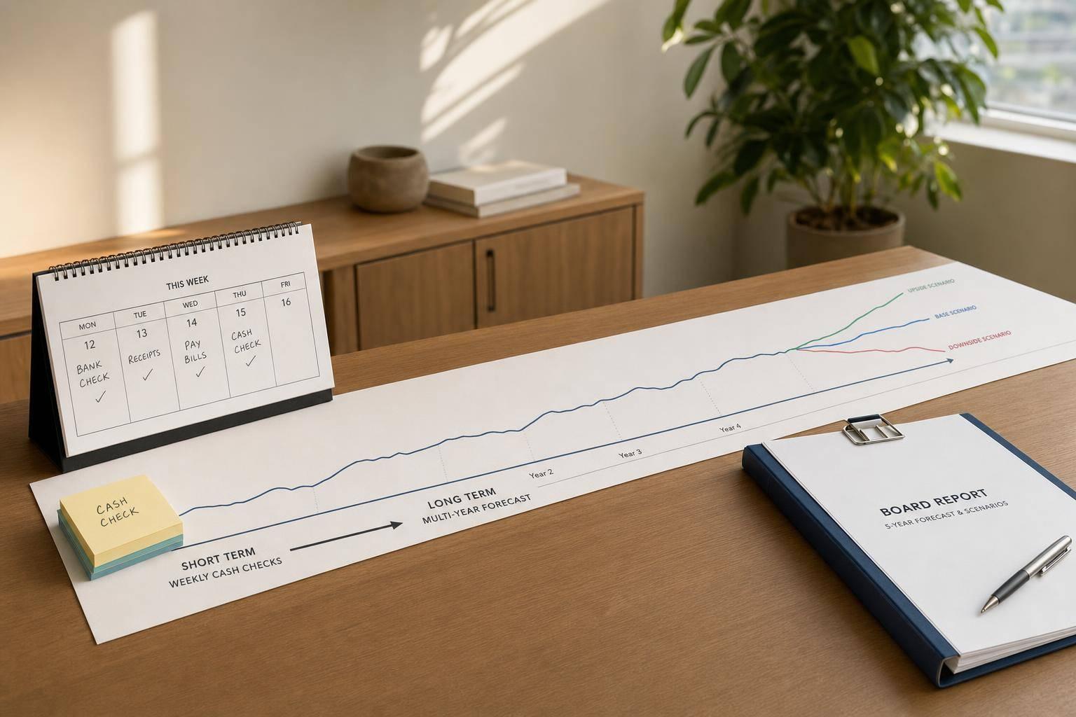
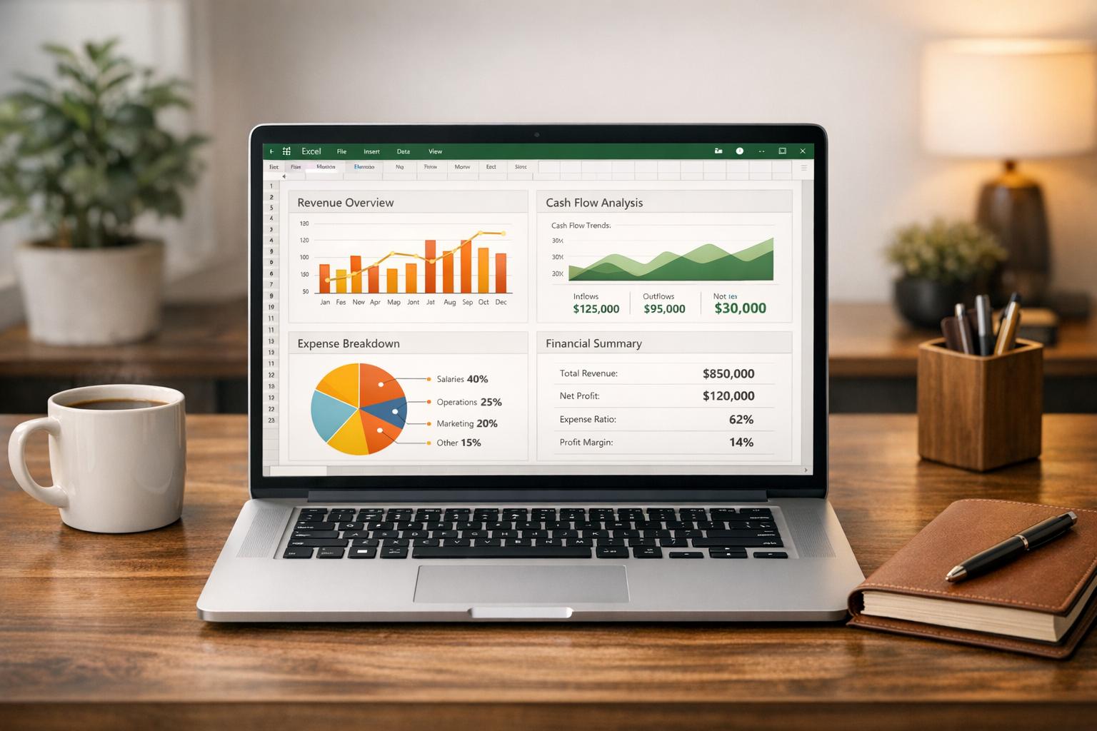
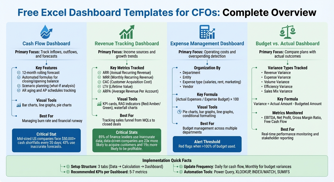
A cash flow dashboard brings together all your incoming and outgoing cash flows, giving you a clear picture of where your money is coming from and where it's going. Many templates provide a 12-month rolling forecast, showing monthly cash movements so you can plan well into the future [5][6].
The most effective templates include automated formulas that calculate your closing balance and carry it forward as the next month's opening balance. This eliminates the need for manual math and keeps your projections seamlessly connected throughout the year. These built-in features make it easier to run scenarios and gain visual insights into your cash flow.
Good templates come with tools for scenario planning, often referred to as "what-if analysis." For example, you can tweak variables like rent or payroll expenses and immediately see how these changes might affect your year-end cash balance [5][3]. This is especially helpful when you're exploring cost-cutting options or planning for growth-related expenses.
Another important feature is the ability to track Accounts Receivable aging and Accounts Payable schedules. Monitoring invoice aging helps you anticipate when cash will actually be deposited into your account - not just when revenue was recorded [1]. Visual tools like bar charts, line graphs, and pie charts make it easier to spot spending trends and budget gaps without having to sift through endless spreadsheets [5][8].
Here's a startling fact: mid-sized companies in the U.S. typically face unexpected cash shortfalls of more than $50,000 every 20 days, and 43% of them rely on inaccurate cash flow forecasts [5]. Using a well-designed cash flow dashboard can help your business avoid falling into those traps.
For CFOs at growing companies, these dashboards offer real-time insights into cash positions and burn rates - the speed at which your business is using up its cash reserves [5][1]. Having this level of visibility is crucial for managing your financial runway and steering clear of cash shortages that could disrupt operations or require emergency funding.
You can also tailor the dashboard to fit your business model. For instance, SaaS companies might want to separate subscription tiers, while construction firms may need to track costs for individual projects [4][6]. The more detailed your inputs - especially for major expenses like COGS, payroll, and rent - the more precise your forecasts will be [5][7].
Make it a habit to update the template monthly with actual data and compare your projections against real outcomes. This practice helps you identify potential issues before they escalate [8][3]. When forecasting future income and expenses, it's wise to be conservative with revenue estimates and generous with expense projections. It's always better to be pleasantly surprised than caught off guard by a cash shortfall [9].
Revenue dashboards take the concept of cash flow tracking a step further by focusing on income sources and growth trends. A revenue tracking dashboard brings all your income data into one place, breaking down exactly where your revenue originates and how fast it's growing. For subscription-based businesses, templates track Annual Recurring Revenue (ARR) and Monthly Recurring Revenue (MRR) while also monitoring key elements like upsell revenue, downgrades, and churn. This level of granularity not only reveals your total revenue but also highlights the specific factors driving each dollar. Dynamic visual summaries make it easier to understand these revenue drivers at a glance.
These dashboards don’t stop at revenue - they also track essential efficiency metrics such as Customer Acquisition Cost (CAC), Lifetime Value (LTV), and Average Revenue Per Account (ARPA). Keeping tabs on these numbers helps you quickly identify potential issues. For example, if your CAC is climbing but your LTV remains flat, it’s a clear signal that your sales and marketing investments may not be delivering the expected returns.
Consider this: 89% of finance leaders make monthly decisions using inaccurate or incomplete data [11]. Yet, companies that adopt data-driven strategies are 23 times more likely to acquire customers and 19 times more likely to achieve profitability [11]. A well-organized revenue dashboard can help ensure you’re not part of that 89%.
Templates often include KPI cards that summarize critical metrics like year-over-year revenue growth, gross profit margin, and Compound Annual Growth Rate (CAGR). Many dashboards also use a "RAG" system - red, amber, and green indicators - to quickly show whether metrics are on target, slightly off, or significantly underperforming. With dynamic filters, you can drill down into data by time period, product line, region, or customer segment. This makes it simple to identify which products are driving growth or which regions might need extra attention. Additionally, waterfall charts provide a clear picture of revenue changes, showing how new revenue, expansions, and churn contribute to your overall growth.
These dashboards transform raw data into actionable insights. By tracking the entire sales funnel - from Marketing Qualified Leads (MQLs) and Sales Qualified Leads (SQLs) to closed deals - you can pinpoint where bottlenecks might be slowing down revenue growth. This forward-looking approach gives you a realistic view of future revenue potential, rather than just reflecting past performance.
To streamline operations, link your Excel dashboard to platforms like Salesforce, Stripe, or QuickBooks. This integration eliminates the need for manual data entry, reducing errors and ensuring your data stays up-to-date in real time. Automation also frees up valuable time, allowing you to focus on analyzing trends instead of wrestling with spreadsheets. Adding a section for commentary alongside your numbers can further enhance the dashboard's value by capturing the narrative behind the data - something stakeholders often find even more meaningful than the figures alone.
Just like cash flow and revenue dashboards, expense management dashboards bring together essential financial data in one place. These dashboards focus on operating costs, helping you quickly spot any overspending. They organize expenses by department, entity, expense type (such as salaries, rent, or marketing), and vendor, giving you a detailed view of spending patterns. Plus, variance analysis highlights how actual spending stacks up against your budget, often revealing issues weeks before the month-end reports arrive.
"A sudden drop in cash, a rising expense trend, or a shrinking profit margin can be immediately surfaced on a dashboard" [2].
With automated calculations doing the heavy lifting - using formulas like (Actual Expenses / Expense Budget) × 100 to show how much of the budget has been used - any figure over 100% is a clear red flag that demands immediate action.
The best templates come packed with tools to make expense tracking easier and more effective. Pie charts break down expenses by category, bar graphs compare budgets side by side, and line graphs reveal spending trends over time. Built-in formulas handle totals, averages, and tax calculations automatically, cutting down on manual errors.
Conditional formatting is a game-changer, using color-coded signals (like red arrows for variances over 5% or 10%) to highlight problem areas. Interactive tools like slicers and dropdown menus let you filter data by month, department, or approval status, so you can drill down without needing to rebuild your dashboard. Features like tracking approval statuses and attaching receipts add another layer of financial control and compliance.
For CFOs, these dashboards are more than just visual tools - they’re a way to manage budgets across multiple departments with ease. By standardizing data entry and approval workflows, you ensure that your financial information is always up-to-date and actionable. During monthly or quarterly reviews, these dashboards help you quickly pinpoint which departments are overspending and by how much, so you can tackle inefficiencies before they spiral out of control.
If you're looking for templates, providers like Vena Solutions, Limelight, and Smartsheet offer free options [13][15][8]. For more advanced templates with interactive features, you can find options for around $11.99 [14]. It’s a small price to pay for the ability to identify cost overruns and reallocate resources effectively - making strategic forecasting a whole lot smoother.
A budget vs. actual dashboard helps you compare your financial plans with real-world outcomes, covering revenue, expenses, and cash flow. The formula is straightforward: Variance = Actual Amount - Budgeted Amount [17]. Understanding these variances is key - a positive variance is great for revenue (indicating higher earnings than planned) but signals overspending when it comes to expenses [17].
These templates automatically calculate variances across critical areas like revenue, volume, price, and costs. For example, Revenue Variance helps you measure sales performance, while Volume Variance shows whether unit sales met expectations. Price Variance evaluates pricing effectiveness [17]. On the expense side, tracking Cost Variance for materials, labor, and overhead can uncover spending inefficiencies. For cash flow, the dashboard should display real-time balances, inflows, outflows, and Free Cash Flow (FCF) - calculated by subtracting capital expenditures from operating cash flow. This figure reveals how much cash is available for growth, debt reduction, or shareholder returns [12].
These tools also allow you to categorize income and expenses in detail, making it easy to drill down and identify the specific department or line item responsible for variances [18]. Visual charts highlight discrepancies at a glance, and automated alerts can notify you when cash reserves dip too low or expenses hit critical levels [12]. This setup not only provides a clear visual comparison but also enables proactive decision-making. Free templates are available from Vena Solutions, insightsoftware, and Focused Energy [26, 21, 9].
Different dashboards focus on various aspects of financial performance. Here's a quick breakdown:
| Type of Variance | Focus of Analysis |
|---|---|
| Revenue Variance | Tracks differences between actual and budgeted revenue [17]. |
| Expense Variance | Highlights gaps in actual versus budgeted expenses [17]. |
| Volume Variance | Examines changes in quantities sold or produced [17]. |
| Efficiency Variance | Measures resource usage compared to expectations [17]. |
| Sales Mix Variance | Evaluates how product mix changes affect profitability [17]. |
When deciding between a standard Excel template and advanced tools, think about your needs. Basic templates track metrics like revenue, expenses, EBITDA, and net profit on a monthly or yearly basis [18]. However, they often require manual adjustments for branding and formatting [17]. On the other hand, advanced dashboards come with automated branding, interactive features, and real-time scenario modeling for rolling forecasts [3].
Each option delivers insights tailored to different levels of complexity.
Budget vs. actual dashboards give CFOs the tools to make quicker, more informed decisions. Metrics like EBITDA, Net Profit, and Gross Margin Ratio can be monitored in real time [18]. When variances appear, you can break them down into components like price, volume, and efficiency to uncover the root cause. For instance, if revenue falls short, is it due to lower sales volume, pricing challenges, or a shift in product mix? [17]
Automated variance analysis saves hours of manual work, allowing you to focus on interpreting the data and taking action [18]. You can quickly identify which departments are driving discrepancies and address issues before they escalate. This transparency also simplifies communication with stakeholders, making it easier to explain results and justify budget changes or strategic shifts. Using flexible budgeting - comparing actual results to an activity-adjusted budget - provides a more accurate view of performance tied to operational realities, rather than static annual plans [17].
Once you've chosen a dashboard template, setting it up with precision is crucial for delivering accurate, real-time insights.
Start by structuring your Excel workbook into three key layers: a Data Tab for raw input, a Calculation Tab for all formulas and logic, and a Dashboard Tab for presenting the final visuals [2][20]. This setup not only keeps your workbook organized but also ensures it's easy to audit and minimizes the risk of accidental overwrites.
Before importing your data, take the time to clean it. Remove duplicates, standardize date formats, and ensure consistent naming conventions. Use the TRIM function to get rid of any extra spaces [20]. After cleaning, convert your data into Excel Tables using Ctrl + T. This step allows the dashboard to automatically adjust as new data is added while also enabling the use of "structured references" in formulas for better readability [20].
For automating calculations, rely on dynamic functions like XLOOKUP, INDEX/MATCH, and SUMIFS to pull data from the calculation layer. Avoid hardcoding numbers to reduce errors [2][20]. To take automation further, use Power Query (Get & Transform) to connect to external systems like QuickBooks or CRMs, enabling seamless data refreshes with just one click [16][20].
When choosing KPIs, focus on 5–7 key metrics that have the most impact, such as Operating Cash Flow, EBITDA, or Net Profit Margin. This prevents overloading the dashboard with unnecessary information [19]. Use Slicers with Pivot Tables to filter data by criteria like region, department, or time period [16][20]. Add Red-Amber-Green (RAG) conditional formatting for quick visual cues on performance [19]. To protect your work, lock the cells containing critical formulas in both the calculation and dashboard layers [2].
Update frequencies should match the importance of the metrics. For instance, track free cash flow daily to maintain a clear picture of financial performance [12]. Budget variances and other broader metrics can be reviewed monthly, aligning with decision-making cycles and board meetings [2][19].
Deciding between Excel and more advanced tools like Power BI or Tableau depends on factors like your company's size, data complexity, and budget. Excel is ideal for quick prototyping, one-off analyses, and tracking in the early stages of a business [16]. On the other hand, tools like Power BI or Tableau excel in handling large-scale data and providing advanced analytics [19].
| Feature | Excel Dashboards | Advanced Tools (Power BI / Tableau) |
|---|---|---|
| Setup Time | Quick; uses familiar tools and existing spreadsheets [19]. | Slower; requires data modeling and software setup [19]. |
| Scalability | Limited; struggles with very large datasets [19]. | High; optimized for massive data volumes from multiple sources [19]. |
| Cost | Low; often included with Microsoft 365 subscriptions [19]. | Higher; typically requires per-user licensing for advanced features [19]. |
| Automation | Partial; manual refreshes or Power Query needed [20]. | Full; supports real-time data updates and cloud-based automation [19]. |
| CFO Use Case | Best for small-scale tracking and initial analysis [16]. | Best for company-wide analytics and predictive insights [19]. |
Data quality is a critical factor. Studies show 89% of finance leaders make monthly decisions based on incomplete or inaccurate data. Meanwhile, organizations that leverage data effectively are 23 times more likely to gain new customers and 19 times more likely to achieve profitability [19]. Choosing the right tool can dramatically enhance decision-making and business outcomes.
Free Excel dashboard templates offer CFOs a cost-effective way to centralize financial data and improve decision-making. By pulling information from accounting systems, CRMs, and banking platforms into one unified view, these dashboards provide a clear and reliable "single source of truth", removing much of the uncertainty from financial planning and strategy [21][11].
Dashboards that monitor cash flow, revenue, and expense trends enable CFOs to move from simply reporting numbers to actively shaping the financial direction of their organizations. Research consistently shows that data-driven approaches can significantly improve both decision-making and profitability. As Istvan Vozar, Founder of Excel Dashboard School, explains:
"Excel remains one of the most accessible platforms for creating dashboards. It offers transparency, full control over formulas, and the flexibility to adapt templates to any organization's reporting needs" [2].
This transparency and adaptability allow finance teams to audit calculations and adjust KPIs as their business grows, making Excel a practical choice for companies in their growth phase.
For the best results, focus on 5–7 key metrics per dashboard, automate data updates to reduce errors, and incorporate visual tools like Red-Amber-Green color coding for quick, actionable insights [11]. Clean data and well-structured formulas are essential for minimizing manual work and enabling teams to concentrate on strategic analysis [10]. With these tools, CFOs can streamline cash flow, revenue, and expense management, enhancing their ability to forecast accurately and lead with confidence - whether it’s preventing cash shortages or preparing detailed variance reports for board meetings.
To keep Excel dashboards accurate, CFOs should aim to reduce manual data entry by linking dashboards directly to source systems like ERP platforms, accounting software, or bank feeds. Leverage Excel’s built-in tools, such as data connections and validation rules, to pull in real-time data and minimize errors. Consistently apply U.S. number formatting (e.g., $1,234,567.89) and lock formula cells to prevent accidental edits. Make it a habit to reconcile dashboard data with financial statements regularly - weekly checks are ideal to catch any discrepancies early.
Automating updates can save time and improve accuracy. Use tools like macros or Power Query, and include a verification process in the dashboard itself. For instance, create a dedicated tab that flags mismatches or missing data using conditional formatting. Quick audits of formulas can also be done with Excel’s Trace Precedents and Error Checking features. For businesses experiencing growth, collaborating with experts like Phoenix Strategy Group can simplify these processes, ensure seamless integration of data sources, and establish strong review practices to maintain reliable and actionable dashboards.
Excel is a go-to tool for performing detailed calculations, quick analyses, and managing datasets that fall within a small to medium range. It's user-friendly and widely recognized, making it a staple in many workplaces. However, its dashboards often feel static, requiring manual updates and offering limited interactivity - think basic chart filters and minimal customization.
Power BI, by contrast, is built for the demands of modern business intelligence. It connects seamlessly to multiple data sources, refreshes data automatically, and handles large datasets effortlessly. Its dynamic, interactive visualizations - like drill-throughs and real-time dashboards - make it a standout choice for creating engaging reports. Plus, Power BI ensures secure sharing across teams and organizations, making collaboration straightforward.
So, while Excel shines in formula-heavy, detail-oriented tasks, Power BI excels at creating scalable, cloud-based dashboards that transform complex financial data into meaningful, actionable visuals.
Excel dashboard templates give CFOs a streamlined, interactive way to view critical financial metrics, turning complex data into clear, actionable insights. By automating data collection through links to accounting systems, bank feeds, and forecasting models, these templates provide real-time updates while minimizing manual errors. This means CFOs can quickly evaluate cash flow, upcoming receivables, and pending payables without digging through endless spreadsheets.
With visual elements like charts, tables, and gauges, these dashboards make it easier to identify trends, assess performance, and test scenarios - whether it’s preparing for a revenue dip or exploring a capital raise. This level of clarity helps CFOs make informed decisions about budgeting, forecasting, and allocating resources. The templates are designed with familiar U.S. formats, such as dollar signs ($), month-day-year dates (e.g., 04/15/2025), and comma-separated numbers, ensuring they’re easy to interpret for stakeholders like board members and investors.
For growth-stage companies, these tools simplify the process of creating investor-ready reports and presentations. They allow CFOs to present a clear, data-backed narrative that supports strategic planning and fundraising efforts. By consolidating data into one place and enabling quick analysis, Excel dashboards shift CFOs from merely reacting to data to proactively driving decisions.