Published on
August 29, 2025

Want faster, smarter financial decisions? Real-time dashboards can help.
These dashboards give instant access to key financial metrics like cash flow, revenue, and expenses. By integrating tools like accounting software, CRMs, and payment processors, you can monitor business health in real time. Whether you're tracking cash runway, customer acquisition costs, or profitability, this guide shows you how to:
Real-time dashboards aren't just about visuals - they help teams act quickly, spot trends, and make informed decisions. With the right design and setup, they become a powerful tool for growth-stage businesses.
Building an effective real-time dashboard starts with having clear goals and selecting the right metrics. Without a defined purpose, even the most visually appealing dashboards won’t provide meaningful insights.
Your dashboard should address a specific financial challenge your business faces. For instance:
To keep things streamlined, assign one primary purpose per dashboard. If you need to analyze different aspects of your business, create separate dashboards tailored to each need.
Dashboards aren’t one-size-fits-all. Different users have different priorities, so it’s crucial to design dashboards with their needs in mind:
Make sure each dashboard provides the right level of detail for its intended audience. A CEO doesn’t need the granular data that a finance team member might rely on, and too much detail could overwhelm them.
The KPIs you choose should reflect your company’s stage and specific challenges. Here are some essentials:
To keep your dashboard actionable, limit it to 5–7 primary KPIs. Each metric should directly inform decisions and have clear benchmarks or targets that define success.
As your business evolves, so should your KPIs. Early-stage companies often focus on growth, while more mature businesses may prioritize profitability and efficiency. Plan to review and update your KPIs quarterly to ensure they align with your current goals.
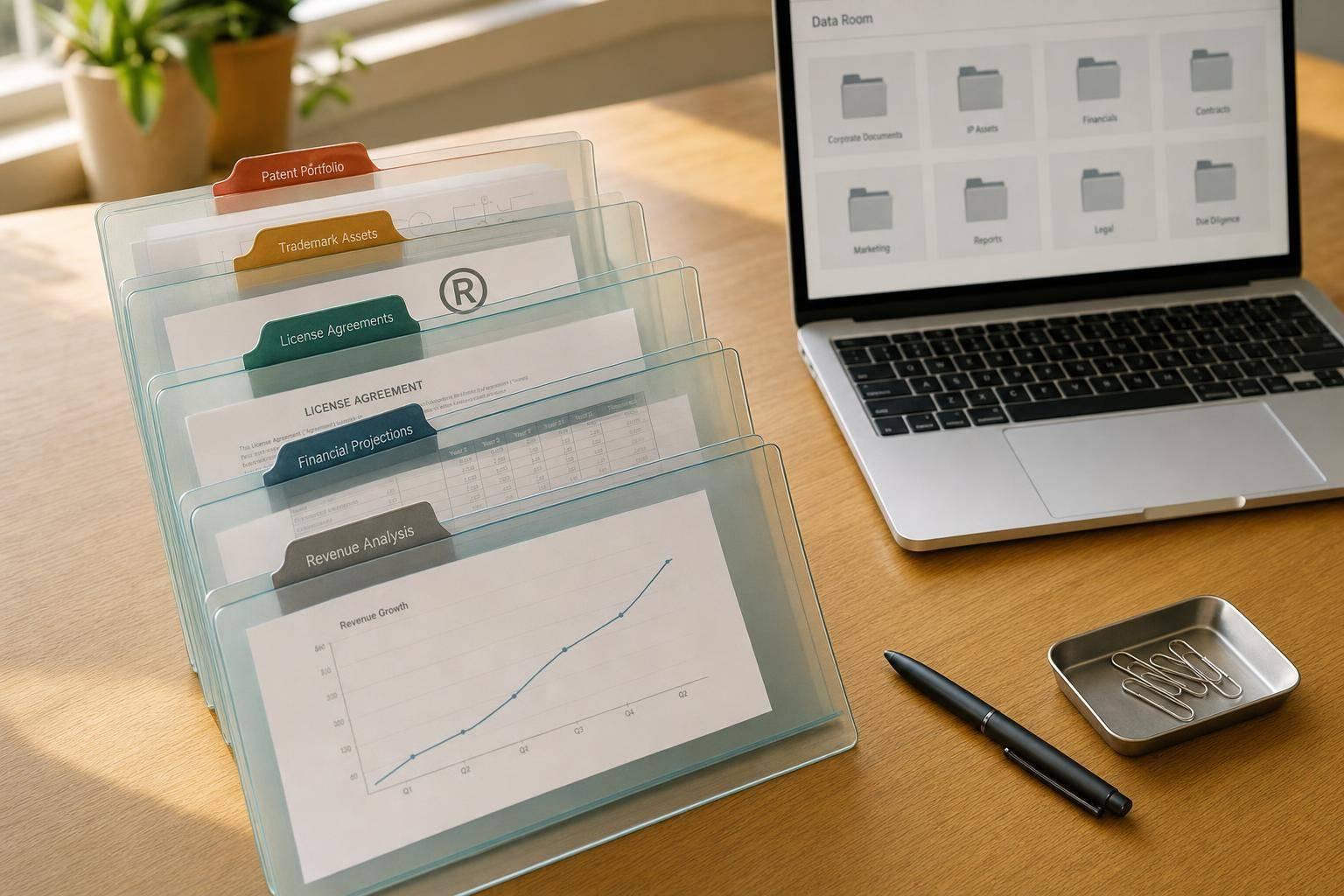
After setting your dashboard goals and identifying the right KPIs, the next step is making sure all your financial systems are connected. Real-time dashboards depend on having a steady and reliable flow of unified data.
Most businesses use a variety of tools to manage finances, and each tool holds a piece of the bigger picture. For instance, your accounting software - like QuickBooks or NetSuite - tracks core financial transactions. Meanwhile, your CRM system stores sales pipeline data that influences revenue forecasts. Payment processors like Stripe or Square handle real-time transactions, and your banking systems provide updates on your cash position.
To bring all this data together, set up automated integrations across these systems. You can use native integrations, APIs, or even a centralized data warehouse to connect accounting, CRM, payment processing, and banking platforms.
Many dashboard platforms come with built-in integrations for popular financial tools, allowing seamless data syncing without custom coding. If native integrations aren’t available, API connections can fill the gap. For businesses with more complex setups, a data warehouse can consolidate information from multiple systems into one central hub.
Companies like Phoenix Strategy Group specialize in helping businesses - especially those in growth stages - build these data pipelines. With the right integrations in place, you can configure your systems to provide continuous, real-time updates.
Manual updates are a recipe for delays and errors. Every time someone has to export a spreadsheet or manually input numbers, you risk introducing mistakes and slowing down your reporting.
Once your systems are connected, focus on automating how often your data refreshes. You can schedule syncs to occur at regular intervals (like every 15 minutes) or trigger updates based on specific events. The frequency of updates should align with how quickly you need to react to changes in your financial data.
To make automation more reliable, implement data validation rules. These rules can screen incoming data for obvious errors - like negative values or unusually high numbers - before it hits your dashboard. Flagging and reviewing these anomalies ensures your data stays clean and trustworthy.
It's also smart to plan for backup and redundancy. For instance, if a key system goes offline, your dashboard can display the last known accurate data instead of going blank. This keeps your reporting stable and ensures your team can keep working without interruptions.
Automated data flows are incredibly useful, but they can also spread errors quickly if you’re not careful. A small mistake in one system can ripple through your dashboard and lead to bad decisions based on faulty information.
To prevent this, set up reconciliation checks to compare data across systems. For example, ensure revenue figures in your CRM align with those in your accounting software, accounting for timing differences. If discrepancies arise, your dashboard should flag them for review instead of masking the issue.
Use data freshness indicators to show how current your information is. Timestamps can display when each data source was last updated, and visual cues like color coding can warn users when data might be outdated. For instance, if your bank connection hasn’t updated in hours, users should know the cash position they’re seeing could be outdated.
Anomaly detection is another helpful tool. It can automatically flag unusual patterns, such as a sudden 500% spike in daily revenue or a drastic drop in customer acquisition costs. These alerts can help you catch and resolve data integration issues before they affect decision-making.
Finally, commit to regular audits of your dashboard data. Periodically compare it with source systems to confirm accuracy. For example, you might do monthly spot-checks to ensure key figures match the data in your accounting software. Document any discrepancies and use them to refine your data processes.
Clean, accurate data builds confidence in your financial dashboards. When leaders trust the information they’re seeing, they’ll rely on it to make faster, smarter decisions instead of treating it as just a visual tool.
Once your data is flowing seamlessly into your dashboard, the real challenge begins: organizing it in a way that’s intuitive and useful for your team. A thoughtfully designed layout can make all the difference between quick, confident decisions and unnecessary confusion.
To make your dashboard easy to navigate, group metrics with similar purposes or themes. This approach ensures clarity and saves time.
For example, keep cash flow, revenue, and expense metrics in separate sections. This is especially helpful for companies juggling multiple financial priorities. If your CFO wants to check the cash position, they shouldn’t have to sift through unrelated metrics like customer acquisition costs or inventory turnover ratios.
Use visual design elements to emphasize these groupings. Try distinct background colors, borders, or generous white space. For instance, revenue metrics could have a light blue background, while cash flow indicators might use soft green.
Position related metrics side by side for better context. For example:
Once the groupings are in place, focus on prioritizing the most critical information.
The layout of your dashboard should guide users’ attention to what matters most. The top-left corner and center of the screen are prime spots - use them wisely for the metrics that have the biggest impact on your business.
For most businesses, cash position is the top priority. Running out of cash is a serious risk, so metrics like current cash balance and burn rate should be front and center. Use large, clear numbers and trend indicators to make these figures impossible to miss.
Revenue trends often take the second spot in importance. Show how the current month’s performance stacks up against targets, complete with a clear trajectory. If you’re ahead of plan, make that success visible. If you’re falling short, highlight the gap.
To emphasize critical numbers:
Time-sensitive information should also be easy to spot. If you’re tracking monthly targets, show progress prominently. For upcoming quarterly board meetings, highlight the metrics that will be most relevant in those discussions.
Not everyone views financial data the same way, so offering customization options is essential. These features allow users to tailor their dashboards to fit their specific needs.
Role-based views are a great starting point. For instance:
Drag-and-drop customization gives users control over their layout. For example, someone who prioritizes cash flow can move those metrics to the top of their dashboard. Similarly, less relevant metrics can be minimized or hidden.
Time period controls let users adjust how they view trends. Include options for common periods like the last 30 days, quarter-to-date, or year-over-year comparisons. Some users may prefer daily details, while others might want broader monthly summaries.
Filtering options allow users to focus on specific segments of data, such as a particular product line, region, or customer group. This makes it easy to drill down without losing the bigger picture.
Save and share capabilities make collaboration smoother. If someone creates a useful layout - like one tailored for monthly board reports - they should be able to save it as a template and share it with the team.
Finally, ensure your dashboard is mobile-friendly. Many decisions happen on the go, so the dashboard should be just as clear and functional on tablets and smartphones. Prioritize the most relevant metrics for smaller screens to keep the layout effective.
Customization should simplify, not complicate. Offer sensible default settings and intuitive guidance to help users create layouts that enhance their decision-making process. Too many options can be overwhelming, while rigid layouts can leave users frustrated. Strike the right balance.
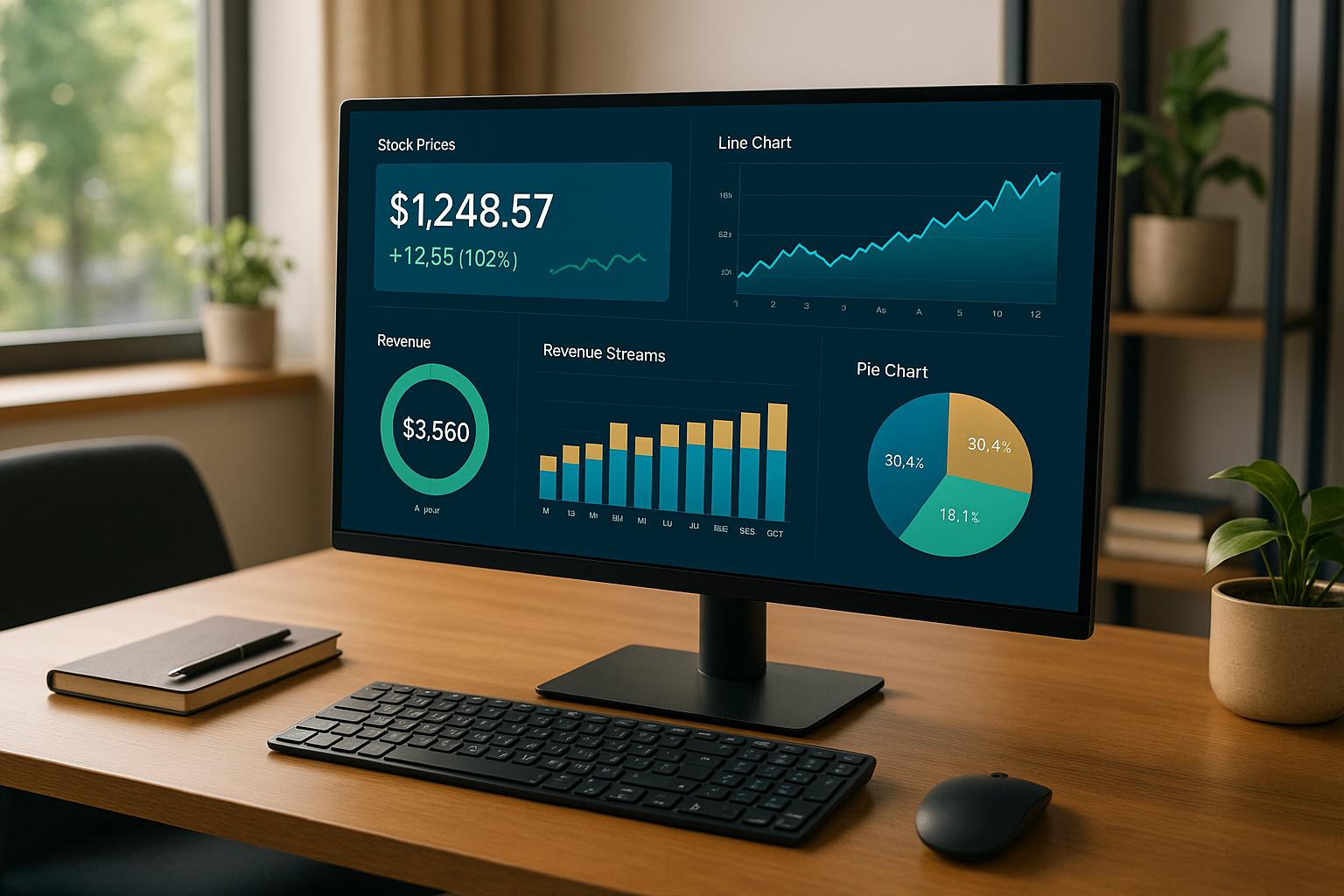
In the fast-paced world of financial dashboards, clear visuals are key to making quick, informed decisions. A well-designed visualization can highlight critical insights, while a poorly designed one risks leading decision-makers astray. Success here boils down to smart chart selection, consistent design, and an unwavering commitment to accuracy.
Not all charts are created equal, especially when it comes to financial data. Picking the right type can make patterns jump out, while the wrong one might leave users scratching their heads.
Tailor your chart choices to your audience. Executives often prefer high-level visuals like trend charts, while finance teams may need detailed tables for deeper analysis.
Consistency in colors and labels not only looks polished but also makes dashboards easier to understand. When users don’t have to decipher inconsistent visuals, they can focus on the data itself.
Finally, use consistent fonts and sizes throughout. Headers should stand out with larger, bold text, but keep the font family uniform across the dashboard. Mixing fonts can make your visuals look disorganized.
Simplicity is the backbone of effective financial visualization. Overcomplicated charts not only confuse but can also lead to poor decisions.
White space is your friend. Spacing out sections and charts makes the dashboard easier to read and less overwhelming. It also helps users process information faster.
Lastly, test your visuals with actual users. What seems intuitive to you as the designer might not be clear to someone else. Ask colleagues to interpret key metrics to ensure your design choices are effective.
The ultimate goal of financial data visualization is to make critical information easy to understand and act on. Every design decision should serve that purpose, ensuring your team can make informed decisions quickly and confidently. Up next: how to enhance dashboard performance and security.
Once you’ve nailed down clear layouts and a consistent visual style, the next priority is performance. A dashboard that drags its feet when loading is practically useless - it slows down decision-making and frustrates users.
Speed matters. Whether executives are reviewing quarterly numbers or finance teams are analyzing cash flow, delays can disrupt critical decisions.
To keep things moving smoothly, start by optimizing your source reports. Use efficient filters, cut out unnecessary columns and rows, and simplify formulas. Whenever possible, base your dashboard on a single, well-organized report instead of pulling from multiple sources. Fewer data runs mean faster load times.
Be selective with the data you include. Instead of loading every transaction from the past decade, focus on the most relevant time frames and metrics. Aggregating data - like summarizing it monthly instead of daily - can also improve both speed and usability.
A clean, straightforward layout is another way to enhance performance. Stick to the essentials and use contextual filters or limited date ranges to keep things snappy. On the database side, make sure frequently queried fields, like dates or account codes, are properly indexed to speed up searches.
With your dashboard running smoothly, the next step is ensuring it’s secure and always up-to-date.
Creating real-time financial dashboards isn’t just about making data look good - it’s about building tools that empower smarter business decisions. When properly designed, these dashboards provide the clarity businesses need to scale effectively.
The design of your dashboard should reflect your specific goals. For instance, a startup gearing up for Series A funding will focus on entirely different metrics than a company eyeing an acquisition. For growth-stage companies, tracking key indicators like unit economics, cash runway, and revenue growth in real time is critical. These metrics enable leadership teams to adapt quickly to changing market conditions or seize new opportunities.
A well-designed dashboard should be easy to use and encourage regular engagement. Keep the layout clean, highlight the most important metrics, and ensure fast load times. Real-time monitoring loses its edge if your dashboard takes 30 seconds to refresh. Critical numbers should be accessible in just a few seconds for both finance teams and executives.
But design alone isn’t enough. A strong technical foundation is just as important. Reliable data connections, stringent security measures, and routine updates ensure your decisions are based on accurate, up-to-date information. Making choices based on outdated data could lead to costly mistakes.
When you combine thoughtful design with solid technology, growth becomes far more achievable. Phoenix Strategy Group works with growth-stage companies to implement financial systems that include real-time dashboards, covering everything from weekly KPI reviews to preparing for fundraising rounds.
As your business evolves, so should your dashboards. A system that works for a $1 million company likely won’t cut it for a $10 million operation. Build your dashboards with adaptability in mind, and be ready to refine them based on user input and shifting business demands.
To keep your real-time financial dashboard accurate and dependable, it's crucial to use automated validation checks. These checks might include verifying data ranges, enforcing specific formats, and comparing related fields to spot and fix inconsistencies quickly. Regular audits and quality checks are also key to ensuring your data remains reliable.
By automating these validation steps with scripts and alerts, you can minimize manual mistakes and maintain consistency over time. Together, these practices create a dashboard you can count on for making informed decisions.
To choose the right KPIs for your business, start by tying them directly to your strategic goals. This way, your KPIs will track progress on what truly matters. Think about where your company is in its growth journey - for instance, startups might zero in on customer acquisition, while established businesses could focus more on profitability or streamlining operations.
Your KPIs should follow the SMART framework: they need to be specific, measurable, achievable, relevant, and time-bound. Pick metrics that offer practical insights and have a direct impact on your key business objectives. As your business grows and market conditions shift, revisit and tweak your KPIs to ensure they remain aligned with your evolving goals.
To create financial dashboards that are both easy to understand and useful, start by choosing chart types that best showcase your data's story. For instance, line charts work well for illustrating trends over time, bar charts are ideal for making comparisons, and heat maps help uncover patterns. If you're dealing with stock market data, candlestick charts are a great choice. The key is to match the chart type to the message your data needs to convey.
When selecting visualization tools, opt for platforms that offer real-time data integration and allow for customization. Popular options like Power BI, Tableau, and QlikView are highly regarded for financial analysis because they can handle complex datasets and provide advanced visualization options. Keep your designs clean and straightforward to ensure the data is easy to interpret at a glance. By aligning your charts and tools with your audience’s needs, you’ll create dashboards that provide meaningful and actionable insights.