Published on
February 22, 2026

Managing multiple properties can feel overwhelming without a centralized system. A property portfolio dashboard simplifies this by consolidating data from tools like Yardi, QuickBooks, and market APIs into one place. This gives you real-time insights into key metrics like occupancy rates, Net Operating Income (NOI), and property valuation, helping you make faster, informed decisions. For example, Orion Real Estate saw a $4.6M valuation boost within 90 days of adopting a dashboard approach.
A well-designed dashboard transforms raw data into actionable insights, allowing you to spot trends, reduce costs, and improve profitability.
Metrics are the backbone of any insightful dashboard. The right data points can reveal whether your properties are thriving, struggling, or somewhere in between. To build an effective property portfolio dashboard, focus on three core areas: occupancy and rental income, operating expenses and Net Operating Income (NOI), and property valuation and ROI.
Occupancy rate is a straightforward yet essential metric, showing the percentage of available units currently rented. You calculate it by dividing the number of occupied units by the total units, then multiplying by 100. For instance, if 95 out of 100 units are occupied, the occupancy rate is 95%. In most residential properties, maintaining occupancy above 95% is crucial for steady cash flow.
But occupancy alone doesn’t paint the whole picture. To better understand your portfolio’s financial health, track the rent collection rate - the percentage of rent collected compared to the total rent due. This metric highlights how well cash flow aligns with expectations. Additionally, monitor gross potential rent, which helps identify untapped revenue opportunities, and leasing velocity, which measures how quickly vacant units are being rented. Changes in these metrics directly influence revenue and NOI, making them vital for your dashboard’s performance tracking [1].
Once rental income is clear, shift focus to your cost structure by analyzing operating expenses and NOI.
Net Operating Income (NOI) is a cornerstone metric for measuring profitability. It’s calculated by subtracting operating expenses from total revenue, excluding costs like financing, taxes, and capital expenditures. As Cynthia Njue puts it:
"NOI is the core measure of property performance because it isolates operating profitability regardless of capital structure." [5]
Operating expenses typically include items like property management fees, insurance, property taxes, and routine maintenance. However, mortgage payments, depreciation, and income taxes are left out. For stabilized residential properties, investors often aim for NOI margins between 50% and 65%.
Another key metric is the Operating Expense Ratio (OER), which compares operating costs to total revenue. For multifamily properties, an OER between 35% and 50% is typical, with ratios under 40% signaling strong performance. Regularly tracking NOI and OER allows you to spot cost increases early and ensure your dashboard reflects accurate profitability trends.
Once you’ve assessed operating performance, turn your attention to valuation and long-term returns.
Valuation and return metrics help you understand whether your portfolio is building wealth over time. Cutting operating costs doesn’t just improve NOI - it can also increase property value. For example, the capitalization rate (Cap Rate), calculated by dividing NOI by property value, allows you to compare returns and risks across different markets and assets. Since property value is often estimated as NOI divided by the Cap Rate, even small reductions in expenses can significantly boost valuation.
Another critical metric is Cash-on-Cash Return, which evaluates the annual return on the actual cash invested. It’s calculated by dividing annual cash flow by total cash invested. Unlike NOI, cash flow accounts for debt service and capital expenditures, giving a clearer picture of the money available to investors. Even with strong NOI, high debt or capital expenses can lead to weak cash flow.
Finally, the Debt Service Coverage Ratio (DSCR) measures whether a property generates enough income to cover its loan payments. It’s calculated by dividing NOI by total debt service. Lenders usually expect a DSCR between 1.25 and 1.50 [6], ensuring that NOI is 25% to 50% higher than debt obligations. This margin provides a safety net against unexpected costs or vacancies.
Incorporating these metrics into your dashboard ensures you can quickly evaluate and communicate the performance of your property portfolio. They provide the clarity needed to make informed decisions and drive long-term success.
Creating a property portfolio dashboard means pulling together data from multiple systems. To get a full picture of your portfolio's performance, you'll need to bring in three key data streams: property and tenant information, financial records, and market intelligence. Each plays a critical role in shaping the insights your dashboard delivers.
Platforms like Yardi, AppFolio, Buildium, Entrata, and Rent Manager are the backbone of property management. They handle everything from rent rolls and tenant details to lease expirations and occupancy rates - essential data for tracking performance metrics [2][3][7]. By integrating this data through APIs, you can avoid manual errors and ensure your dashboard always reflects up-to-date information.
Monika Stando, Marketing Campaigns Team Leader at Hicron Software, highlights the importance of consolidating data:
"A unified dashboard for multi-property portfolio management is a centralized platform that consolidates data from multiple properties and software systems into a single, interactive view" [7].
In many cases, different properties within a portfolio might rely on separate systems - one using Yardi, another using AppFolio. Integrating these systems eliminates silos, making cross-property comparisons more accurate. Once this is in place, the next step is linking your accounting software to sync operational and financial data seamlessly.
Accounting software like QuickBooks and Xero provides the numbers you need to track key financial metrics like net operating income (NOI), operating expense ratios, and cash-on-cash returns. These tools capture data on operating expenses, capital expenditures, and general ledger entries - details that property management systems might miss [3][5]. Connecting these tools via APIs simplifies reporting and reduces manual effort.
For example, manually compiling monthly reports for a property portfolio can take around 40 hours of staff time. An automated dashboard cuts that down to just 8 hours, saving 80% of the labor [5]. At a labor cost of $60.00 per hour, this automation translates to an annual savings of $8,640.00 after factoring in software costs [5]. On top of that, linking directly to bank deposit feeds allows real-time tracking of rent receipts and automatic reconciliation with financial statements. This means you can monitor cash flow as it happens, rather than waiting until the end of the month [5].
Market intelligence adds another layer by showing how your properties stack up against local competition and broader market trends. APIs for market data provide insights into rental rates, housing supply and demand, and property valuations. This information helps you pinpoint whether performance issues are due to internal challenges or external market conditions [2]. With this integration, you can quickly adjust pricing or leasing strategies based on real-time trends.
To ensure smooth data integration, it's crucial to set up consistent protocols. Use APIs instead of manual exports, standardize formats across systems (especially for dates and property names), and establish clear labeling rules for all entries [2][7]. These steps help align data from operational, financial, and market sources, ensuring your dashboard delivers accurate, actionable insights. By building these foundations, you avoid the pitfalls of "bad data" and create a tool that reflects the true state of your portfolio.
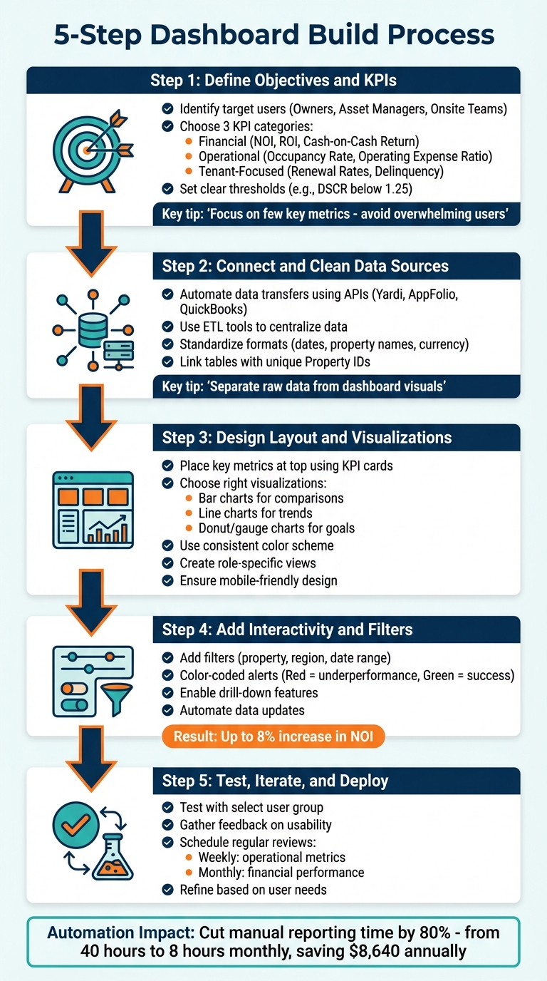
5-Step Property Portfolio Dashboard Build Process
Creating a dashboard that delivers clear and actionable insights starts with a strong data foundation. Follow these five steps to build a dashboard that prioritizes usability and impactful visuals.
Begin by identifying the target users of the dashboard and the decisions they need to make. For example:
Tailoring views to specific roles prevents clutter and ensures relevance. Start with a clear goal - whether it's increasing NOI, reducing tenant turnover, or pinpointing underperforming assets. As Filip Stojanovic from Databox advises:
"It's much more efficient to set a specific goal and then cherry-pick the most important metrics that you'll include. This is a huge mistake [to include too many]."
Focus on a few key metrics - like NOI, cash flow, and occupancy - that provide the most insight. Avoid overwhelming users with excessive data.
Standardize how metrics are calculated across your portfolio. For example, define exactly how NOI is measured and establish thresholds for immediate action, such as a Debt Service Coverage Ratio (DSCR) falling below 1.25.
Organize your KPIs into three main categories:
This structure provides a comprehensive view of your portfolio's health. Retention metrics, in particular, are crucial since renewing a lease can be up to four times cheaper than acquiring a new tenant. With clear objectives and KPIs in place, move on to preparing your data.
Once KPIs are defined, it's time to organize your data. Automate data transfers from systems like Yardi, AppFolio, or QuickBooks using APIs, eliminating manual exports and reducing errors. Automation ensures your dashboard reflects up-to-date information.
Raw data often arrives in inconsistent formats. Use Extract, Transform, and Load (ETL) tools to centralize data into a unified structure. Ensure numerical fields are properly formatted, currency symbols (e.g., "$") are removed, and missing values are standardized as null for accurate calculations.
Link tables using unique identifiers like Property IDs to enable filtering and cross-analysis. For example, connect a "Rent Roll" table to a "Properties" table. Address any gaps, such as missing "Move-Out Dates" for vacant units, as these can distort occupancy calculations.
When dealing with data from multiple regions, use consistent settings for dates and property names. Standardize account codes and adopt a unified chart of accounts to streamline reporting.
Place key metrics - like Occupancy Rate and NOI - at the top of the dashboard using KPI cards for quick access. These cards should display current values, period-over-period changes, and visual indicators (e.g., green for positive trends, red for declines).
Pair each metric with the appropriate visualization:
If you're using spreadsheets, leverage PivotTables and PivotCharts for dynamic summaries and automatic updates. As Spencer Lanoue from Bricks points out:
"The success of any dashboard depends on clean, well-structured data. The best practice is to separate your raw data from your dashboard visuals."
Use a consistent color scheme to guide attention, and remove unnecessary gridlines for a polished look. Make sure the layout is mobile-friendly so field staff can access it on tablets or smartphones.
Tailor views based on roles:
Static reports can’t compete with dashboards that allow users to interact with the data. Add filters for property names, regions, or date ranges to make the dashboard more dynamic. This turns it into an exploration tool rather than a static report.
Incorporate alerts with color codes - red for underperformance and green for success - to highlight key metrics. Enable drill-down features so users can click on a summary metric (like NOI) to view detailed breakdowns of income and expenses.
Automate data updates by integrating the dashboard with property management software. Real-time updates ensure the data reflects current conditions, helping teams make quicker and more informed decisions. Some teams have seen up to an 8% increase in NOI by leveraging automated insights.
Once interactivity is in place, test the dashboard with real users to ensure its effectiveness.
Before rolling out the dashboard across your organization, test it with a select group of users. Assign tasks like identifying properties with the lowest occupancy or those exceeding maintenance budgets. Gather feedback on usability and identify any missing or unnecessary elements.
As Sam Caulton, CFO at Re-Leased, explains:
"KPIs are more than a reporting requirement. They are the language you use to explain performance to owners and stakeholders."
If users struggle to extract insights, refine the layout and visualizations. Establish a schedule for regular reviews - weekly for operational metrics like collections and occupancy, and monthly for financial performance against budgets. These reviews help ensure the dashboard stays aligned with your goals as your portfolio evolves.
Once your dashboard is up and running, keeping it effective means ensuring it always reflects the latest data. A dashboard that displays outdated information can lead to poor decisions and missed opportunities. The following tips can help you keep your dashboard accurate and actionable.
Reference lines are a simple but powerful tool to track key metrics like occupancy rates, Net Operating Income (NOI), or renewal percentages. For example, you can set a reference line at a target like 95% occupancy and quickly spot properties falling short. Comparing actual performance against gross potential rent can also reveal early warning signs [1] [3].
"Effective dashboards use clear visual cues, such as color indicators, trend markers, and thresholds to surface risk and opportunity quickly" [1].
It’s also helpful to compare against external benchmarks, like market rent trends, rather than just internal targets. This added context can highlight whether an issue is property-specific or part of a broader market trend.
To make this even more user-friendly, consider pairing these reference lines with intuitive color coding.
Color coding is another way to make data interpretation quick and easy. A traffic light system - red, yellow, and green - can signal performance status at a glance [7].
"Best practices for dashboard design prioritize visual clarity. This involves using a consistent color scheme... to guide the user's eye to the most important metrics. For example, using red or green indicators can instantly show performance against a target" [7].
Icons can further enhance clarity. For instance, a green upward arrow can show improvement, while a red downward arrow signals a decline. Consistency in your color scheme across all dashboard views - whether at the portfolio or property level - helps users quickly understand the data [7].
Manual data entry is not only time-consuming but also prone to errors. Automating data synchronization ensures your dashboard stays up-to-date while saving property managers hours of work each day [4].
Cloud APIs can connect your dashboard to property management systems like Yardi, AppFolio, or Buildium, enabling real-time updates on rent payments, lease changes, and maintenance requests [8].
"AI-powered automation removes the bottlenecks of repetitive tasks and keeps operations running smoothly. Automation boosts both efficiency and tenant satisfaction" [8].
IoT sensors can also provide real-time updates. For example, sensors monitoring HVAC systems, energy usage, or water leaks can send alerts directly to your dashboard, allowing you to address issues like leaks before they cause significant damage [8].
Centralizing data from various sources - tenant portals, financial tools, and maintenance logs - into one platform reduces errors and improves efficiency.
"A centralized platform brings all critical information into one place, which reduces errors and improves efficiency" [8].
Additionally, AI-driven validation can ensure data accuracy before it’s synced. Machine learning can catch issues like duplicate entries or formatting errors, allowing property managers to make quicker, better-informed decisions. This approach has been shown to increase Net Rental Income growth by up to 3.5% [1].
Creating a property portfolio dashboard goes beyond just organizing data - it’s about transitioning to a more strategic, forward-thinking approach. By consolidating rent rolls, maintenance requests, and financial statements into one centralized platform, you can eliminate inefficiencies and respond with informed, timely actions.
"Property performance dashboards for multifamily portfolios should not exist just to report numbers. Their real purpose is to help teams understand what is happening across a portfolio and act early, before opportunities are missed or risks compounds."
– Rentana
This shift allows raw data to evolve into actionable insights. The best dashboards provide real-time updates on key metrics like Net Operating Income (NOI), delinquency rates, and rent growth. With this information at your fingertips, pricing and renewal decisions can be based on clear trends and actual property performance rather than speculation.
To streamline the process, expert assistance can make a significant difference. Partnering with professionals can simplify the complexities of building advanced data models. For instance, Phoenix Strategy Group (https://phoenixstrategy.group) offers specialized services in fractional CFO support, FP&A systems, and data engineering. They focus on transforming time-consuming manual reporting into fast, automated insights. With their expertise in real-time financial data integration and KPI development, your dashboard can become a tool for active decision-making rather than just a static report.
The ultimate goal is to design dashboards that highlight early warning signs - like declining demand or increasing maintenance expenses - before they affect profitability. By combining integrated data, user-friendly design, and expert guidance, your dashboard becomes a powerful ally for real-time financial management.
Tracking the right KPIs is essential for understanding the financial health and operational performance of your property portfolio. Start with key metrics such as cash flow, revenue, expenses, and cash reserves. For real estate portfolios, make sure to also monitor loan balances and overall portfolio performance. These fundamental indicators provide a snapshot of your portfolio's stability and efficiency, helping you make informed decisions from day one.
To bring data together from various systems, leverage APIs, ETL/ELT processes, and automation tools. Start by connecting essential systems like financial software, CRMs, and property management platforms. Automate regular updates and implement validation rules to maintain both accuracy and security across the board. For portfolios with more intricate setups, consider using a centralized, real-time dashboard. This approach consolidates all your data into a single, clear view, making it easier to gain insights and make informed decisions.
Dashboards that refresh automatically are crucial for delivering accurate, real-time data. For property portfolio dashboards, refreshing every 5 minutes to an hour strikes a good balance. This timing ensures you’re working with current insights without putting unnecessary strain on your system. The best refresh interval ultimately depends on your specific requirements and the capacity of your data sources, as emphasized by Phoenix Strategy Group’s experience in creating real-time financial dashboards.