Published on
June 29, 2026


A promo is not a win just because sales go up. If discount rate climbs, margin falls, inventory misses, or new buyers never return, that promo can lose money fast.
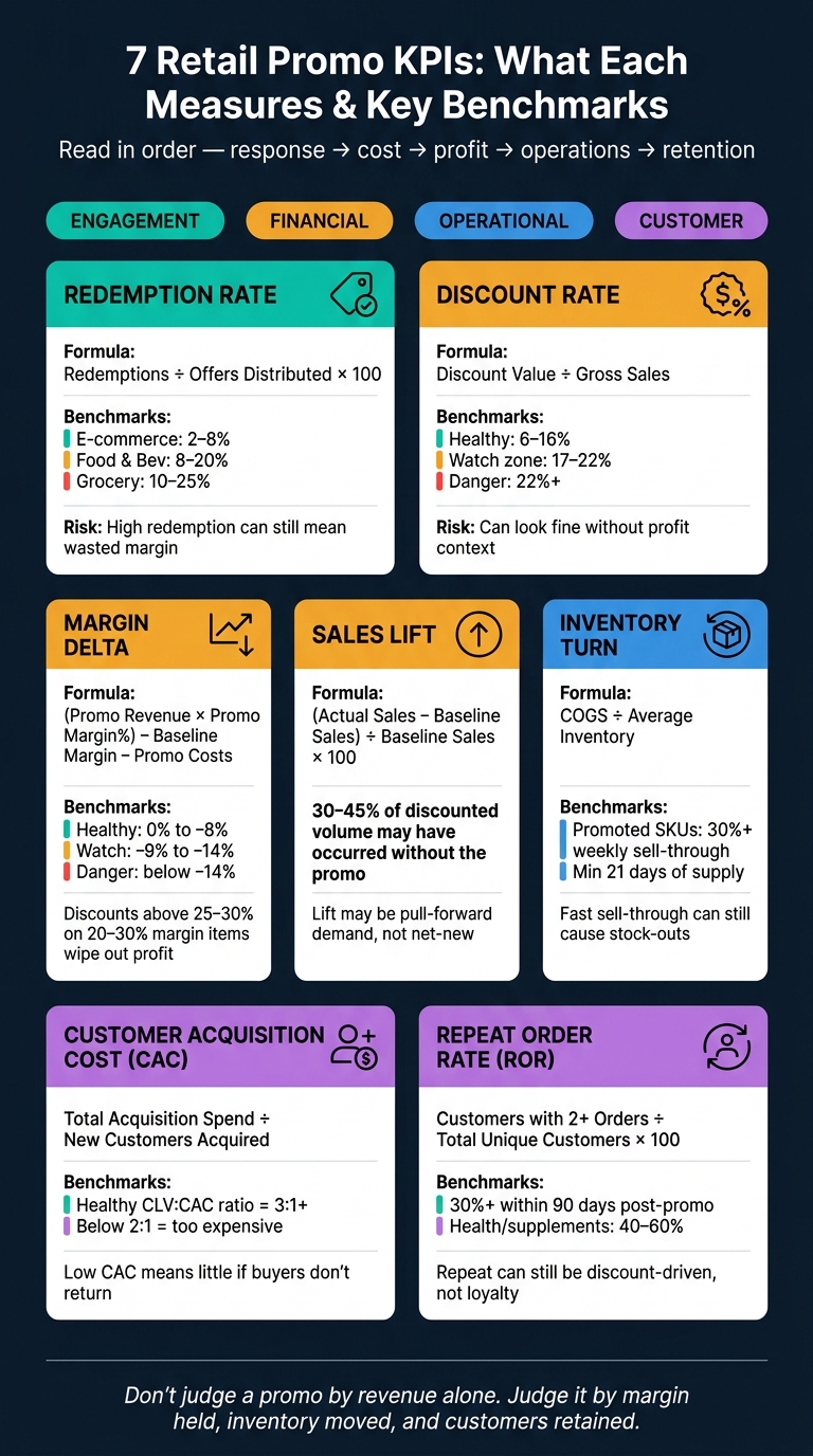
Here’s the short version: I’d track 7 KPIs in one dashboard to judge a retail promotion from start to finish:
A few numbers from the article make the point fast:
If I were reading this dashboard in real time, I would not look at these KPIs one by one. I’d read them in order: response, cost, profit, stock movement, and repeat value. That is the fastest way to tell whether a promotion drove good demand or just bought short-term volume.
| KPI | What it tells me | Main risk if viewed alone |
|---|---|---|
| Redemption Rate | Offer response | High usage can still mean wasted margin |
| Discount Rate | Promo cost | Can look fine without profit context |
| Margin Delta | Profit change vs. baseline | Can miss demand story by itself |
| Sales Lift | Demand increase | Lift may be pull-forward, not net-new |
| Inventory Turn | Stock movement | Fast sell-through can still lead to stock-outs |
| CAC | Cost to win a new buyer | Low CAC means little if buyers do not stay |
| Repeat Order Rate | Post-promo retention | Repeat can still be discount-driven |
So the core takeaway is simple: don’t judge a promo by revenue alone. Judge it by whether it held margin, moved the right inventory, and brought back customers at a cost that makes sense.
7 Retail Promo KPIs: What Each Measures & Key Benchmarks
A good promo dashboard works best when it groups KPIs into four buckets: engagement, financial, operational, and customer. That setup makes the seven KPIs below much easier to scan as one story instead of a pile of numbers.
Each KPI group answers a different business question.
Engagement metrics show whether people found the offer strong enough to act on. Financial metrics show whether the promo paid off. Operational metrics tell you if inventory and fulfillment stayed on track. And customer metrics show whether the promo brought in shoppers worth keeping, or just one-and-done buyers.
That distinction matters. One good-looking number can hide a problem somewhere else. High engagement with weak financial returns is a common trap, especially during high-volume periods.
No single system gives you the whole picture.
POS data shows in-store basket mix and markdown efficiency. E-commerce platforms track site traffic, funnel performance, and online conversions. Marketing data shows channel spend, email open rates, and paid search performance. Inventory systems track stock levels and sell-through. CRM and loyalty data help segment customers by purchase history and buying frequency.
Put POS, e-commerce, marketing, inventory, and CRM data into one view. That’s how teams stop guessing and start seeing what the promo is doing across the business.
The most useful dashboards separate metrics into primary metrics, diagnostic metrics, and guardrail metrics.
Guardrails are there to stop teams from chasing volume at the wrong cost. That can mean a margin floor that warns you when discount depth starts wiping out profit. It can also mean a customer fatigue indicator that shows whether repeat promos are driving less lift over time.
For context, discounts above 25–30% on products with standard gross margins of 20–30% typically eliminate profit entirely, regardless of volume growth [3]. If your dashboard doesn’t show that threshold in real time, your team is flying with a blind spot.
The seven KPIs below show how to judge promo performance in real time.
What it is: The share of sent offers that customers actually used. The formula is simple: (Number of Redemptions ÷ Number of Offers Distributed) × 100 [10][7].
The business question it answers: Did the offer reach the right shoppers? If redemption is low, the issue usually comes down to three things: the offer wasn’t strong enough, the targeting was off, or the redemption process had too much friction [6][7]. If redemption is very high, that can be a warning too. It may mean you discounted too heavily or gave discounts to shoppers who would have bought anyway [6][7].
Use redemption rate as your first check on offer pull. Then look at it alongside discount rate and margin delta to see what it did to profit.
2026 industry benchmarks help show where your number may fall [7]:
| Industry | Average Redemption Rate | High Performer |
|---|---|---|
| E-Commerce (General Retail) | 2% – 8% | 12%+ |
| Food & Beverage / QSR | 8% – 20% | 25%+ |
| Grocery / On-Demand Delivery | 10% – 25% | 30%+ |
Email-distributed offers usually land in the 5% to 15% range, while mass distribution tends to fall to 2%–8% [7]. If your e-commerce campaign comes in under 2%, it’s a good sign to review targeting, offer strength, and redemption friction before the next send [7].
When it matters most: This KPI is most useful for offer tests, clearance, and lapsed-customer win-back. During holiday periods, watch for pulled-forward demand - customers buying earlier than they otherwise would [8][4].
Break it out by:
If the top 20% of redeemers account for 60%–70% of all promotional discounts, the program is probably acting more like a frequent-buyer subsidy than an acquisition tool [9].
Redemption shows response; discount rate shows the cost.
Redemption shows demand. Discount rate shows what that demand costs you.
What it is: Discount rate is the share of gross sales lost to discounts. The formula is: Discount Value ÷ Pre-discount Basket (Gross Sales) [11]. Use gross sales as the denominator so you can see the full revenue hit from the offer [12].
On its own, this metric tells part of the story. Read it alongside redemption and margin delta to separate volume from value.
The business question it answers: Is this promotion costing too much to drive demand? [12] If your discount cost ratio climbs past 22%, you're in a high-risk range. A healthy range is 6% to 16%, while 17% to 22% is the watch zone [12].
That’s why discount rate shouldn’t sit there as a simple campaign readout. It works better as a guardrail. A promo can look strong on the surface because lots of people redeemed it, but if too much revenue disappears into the discount, the math starts to turn against you.
Use deeper discounts for short flash events, moderate discounts for acquisition and win-back, and lighter discounts for loyalty [7].
When it matters most: Watch this KPI during clearance, acquisition analysis, and any promotion where redemption is climbing while margins are getting squeezed. If discount rate rises faster than sales, the promotion is getting more expensive [12][11].
Key segmentation cuts: Break discount rate down by product category and offer mechanic. That helps you spot SKUs that only move when you cut the price [13].
Discount rate tells you what the promo cost. Margin delta tells you what it gave back.
What it is: Margin delta, also called Incremental Margin or Margin Impact, measures the change in profit against a nonpromo baseline [4][14]. The core formula is: (Promo Revenue × Promo Margin%) − Baseline Margin Dollars − Promo Costs [6]. That means you need to account for more than the discount itself. Include vendor funding, fulfillment, shipping, cannibalization, and post-promo dips [4][14].
This metric makes the most sense when you read it alongside sales lift. A spike in volume can look good on the surface, but the key issue is simple: did that extra demand pay for the margin hit?
The business question it answers: Did the volume lift offset the discount and operating costs enough to make the promo worth it? [14][6] That’s the heart of it. Roughly one in three promotions drives sales lift but little or no incremental profit after trade spend and cannibalization [15]. So a promo can move a lot of units and still be a bad deal. If it brings in less profit than it costs, it’s expensive, not effective.
After that, look at inventory turn. That helps you tell the difference between healthy sell-through and margin loss driven by over-discounting.
When it matters most: A net margin per order change of 0% to −8% is healthy. −9% to −14% is a watch zone. Below −14%, the promo is likely too deep [12].
Key segmentation cuts: This is where margin delta gets more useful. In practice, use it on high-volume SKUs, deep-discount tests, and campaigns where cannibalization can hide behind sales lift. Then break it down by:
That last cut is often the eye-opener. Two promos can post the same sales lift, yet one holds margin and the other leaks profit.
If margin delta tells you what happened to profit, sales lift tells you what happened to demand.
What it is: Sales lift measures the increase in sales volume, revenue, units, or orders during a promo period against an expected baseline. In plain English, it shows how much extra demand the promo generated [4][8]. The formula is simple: (Actual Sales − Baseline Sales) ÷ Baseline Sales × 100 [8]. On its own, lift can look great. But you need to read it alongside discount rate and margin delta to see whether that extra volume was worth the cost.
One common mistake is using the week right before the promo as the baseline. That can make lift look bigger than it was, especially when shoppers hold off and wait for the deal [16]. A better option is to use prior-year comparable weeks, similar earlier periods, or a 4–6 week pre-announcement average [6][16][18].
The business question it answers: Did the promotion actually sell more? [16] That’s why sales lift is a core KPI when the goal is to clear overstock, bring in traffic, or compare different promo types across a broader plan [4][6][8][17].
Use lift with discount rate and margin delta to separate volume from value.
Even when lift looks strong, part of that demand may have happened anyway. In frequent-purchase retail, as much as 30% to 45% of discounted volume may have occurred without the promotion [9].
Key segmentation cuts: Break lift down by channel, segment, category, and region or store. You can also compare promo regions with matched control markets to isolate incremental demand [14][18]. And watch the post-promo dip. If sales fall hard in the one to two periods after the event, that can be a sign the promo pulled demand forward from future periods instead of creating new demand [6].
Sales lift tells you whether demand went up. Inventory turn tells you if your stock was ready for that spike.
What it is: Inventory turn measures how fast inventory moves during a promotion. The standard formula is Cost of Goods Sold (COGS) ÷ Average Inventory [1]. In promo dashboards, teams often use simpler readouts too: Sell-Through Rate (Units Sold ÷ Starting Inventory) and Days of Supply (current inventory ÷ forecasted daily sales) [2][4].
This matters because a promotion can cut both ways. You can sell out too fast and miss sales, or move too slowly and get stuck with leftover stock.
The business question it answers: Is the promotion clearing the right stock at the right speed? Promoted SKUs should be above 30% weekly sell-through, and you should keep at least 21 days of supply on hand [2].
When it matters most: Inventory turn matters most in clearance events, end-of-season exits, and any campaign built to move aged or overstock inventory [4][6]. It also matters a lot when carrying costs are high. Think furniture, appliances, or bulky seasonal goods. In those cases, slow-moving stock ties up cash and takes up shelf or warehouse space.
Key segmentation cuts: Break inventory turn down by SKU, category, store or region, and channel. That helps you spot where the promo is moving too slowly or too fast. SKU-level tracking is especially useful because it shows the exact slow-movers that need triage [2][1]. Channel cuts can show whether stock is moving faster online or in-store, which changes replenishment calls. To separate actual demand from pull-forward, use a stable 12- to 16-week baseline [9].
After promo efficiency, the next thing to check is simple: did the discount bring in customers who were worth the cost?
What it is: CAC measures the total cost to acquire a first-time buyer, including media, markdowns, agency fees, displays, and fulfillment subsidies [19][4]. First-order discounts should be counted as acquisition spend too.
The business question it answers: CAC only means something when you connect it to future value. A low CAC sounds good, but it only helps if those new customers go on to produce margin over time. That’s why CAC sits right between customer performance and financial performance. In retail, a healthy CLV-to-CAC ratio is 3:1 or better. If it drops below 2:1, acquisition is too expensive [19]. Put another way, CAC is a financial guardrail, not just a marketing number.
When it matters most: CAC is the main lens for first-order or welcome offers, where the discount is treated like an investment in future revenue. It also matters when entering a new retailer or market, where teams need to show trial uptake fast [20].
Key segmentation cuts: Break CAC down by channel, offer type, category, and customer segment [19][21]. Use identity-linked data to separate first-time buyers from existing customers. Then track post-promo behavior for 8–12 weeks to confirm those buyers were actually new [22].
If CAC comes in too high, the next step is to see whether those first-time buyers come back.
After CAC, Repeat Order Rate shows whether those customers came back.
What it is: Repeat Order Rate (ROR) measures the share of promo customers who place another order. You track it at the customer level. The standard formula is (Customers with 2 or More Orders ÷ Total Unique Customers) × 100 [23][24].
For post-promo tracking, a window-based version is often more useful. In that case, divide the number of customers who purchased again within 30, 60, or 90 days by the total unique customers who redeemed the promotion [7][11].
The business question it answers: ROR tells you whether a promotion brought in repeat buyers or just a one-and-done purchase. Health & supplements often land in the 40–60% range, pet supplies in 40–55%, and home goods in 15–25% [24]. A repeat rate of 30% or higher within a 90-day window after the promo is a healthy post-promo benchmark [6][7].
When it matters most: ROR matters most when a promo is supposed to lead to repeat, full-price buying. That’s especially true for new-customer acquisition campaigns, where a loss-leading welcome offer only works if those buyers come back and pay full price later [4][6].
It also matters for win-back campaigns and loyalty programs. The core issue is simple: do customers return to normal buying, or do they vanish once the deal is gone? [4][7] If customers only repeat during promotions and not between them, the brand may be training them to wait for discounts instead of buying at full price [7][9].
Key segmentation cuts: Break ROR down by:
Look for the SKUs that drive the highest repeat rates so you can sharpen future targeting [23]. Also track whether first-time promo buyers come back to buy at full price within 30–60 days. That’s the clearest sign of loyalty instead of discount dependency [6].
Read ROR alongside CAC, margin delta, and sales lift to tell the difference between profitable retention and repeat buying driven by deals alone.
Treat these seven KPIs like a sequence, not a pile of separate numbers. Start with activity, move to economics, then operations, and finish with retention. Once each KPI is defined, read them as one chain: offer response, margin impact, operational strain, and repeat value.
A high redemption rate can look great at first glance. But it can also hide a mess.
If redemption is strong while margin delta is sharply negative, the promotion may have hit people who already planned to buy. Or it may have pulled demand forward instead of creating new demand. That’s why you need to track incremental margin per redemption:
(promo margin − baseline margin) − incentive and campaign costs
If that number stays negative, the offer is too rich.
Strong sales lift only matters if CAC stays under control. A promotion can post nice volume and still fall short if it brings in customers who don’t stick around.
Look at sales lift next to CAC and compare it with breakeven lift:
(original margin ÷ margin after discount) − 1
That gives you a much clearer read on whether the extra sales were worth what you gave up.
A faster inventory turn during a promotion usually points to strong demand and faster inventory recovery. That sounds good. But it only works if service levels hold up.
If stock-outs rise or fulfillment slips, the damage often shows up later as weaker repeat behavior. So track service level and stock-out rate alongside inventory turn. Speed is good. Empty shelves aren’t.
Use these KPIs in three stages. The clearest way to read them is by time horizon, not by metric alone.
| KPI Group | Time Horizon | Core Question |
|---|---|---|
| Redemption Rate, Discount Rate, Sales Lift | In-campaign | Did the offer drive activity? |
| Margin Delta, Inventory Turn | Immediate post-promo | Was it financially and operationally sound? |
| CAC, Repeat Order Rate | Weeks after promo | Did it build lasting customer value? |
A promotion can post strong numbers in the first group and still miss the mark if the second and third groups look weak. In that case, the promo didn’t work. It just looked good for a few days.
Use this sequence to judge whether the promotion is worth repeating.
A promo dashboard should show the right view for the right question. If a team has to dig around just to figure out what happened, the dashboard isn't doing its job.
In U.S. retail, time-based views are a must. A 12-week rolling view gives enough context to spot demand patterns without getting buried in day-to-day noise. Pair that with 7-day moving averages and daily unit sales so you can catch spikes while they're happening [2].
The U.S. retail calendar has a few moments that can change promo results in a big way: July 4th, Black Friday, and the full Q4 holiday period. Each one needs its own pre- and post-promo window. That makes it much easier to spot pull-forward demand instead of mistaking it for net-new sales.
With those windows in place, every KPI is easier to read in context.
Store vs. e-commerce is the basic split, but by itself, it doesn't tell the whole story. Marketplaces, wholesale accounts, and BOPIS (buy online, pick up in-store) orders all come with different margin profiles and fulfillment needs. If you roll them together, those differences disappear.
For location cuts, start at the region level and drill down into city, district, and store trade area. One detail people skip all the time: normalize POS data for U.S. time zones. A midnight sales spike in the Pacific time zone can show up as a different day in Eastern time if the system isn't aligned. That creates fake patterns in daily reporting. Without one shared reporting layer, these cuts get messy fast.
These splits feed the benchmark views below.
At the product level, cut the data by SKU, category hierarchy, brand, and supplier. At the campaign level, the most important split is promo sales vs. baseline sales and incremental vs. total sales. That's the line between seeing promo lift and just looking at normal demand with a discount slapped on top.
For customer cuts, separate new, returning, and loyalty shoppers. A promo that brings in first-time buyers tells a different story from one that mostly gets existing customers to stock up.
Once those cuts are in place, compare them against a baseline.
Use these three benchmark views to measure incrementality:
| Benchmark View | What It Answers | Best Approach |
|---|---|---|
| Promo vs. Baseline | Did the offer add demand or just move it? | Time-series models or year-over-year adjustments [14][6] |
| Control vs. Exposed | Did the promo actually cause the lift? | Use holdout regions or matched stores to test causality [2][14] |
| Pre vs. Post Window | Did demand pull forward? | Compare 1–2 periods after the promo to baseline [6] |
Also track halo effects - non-promoted items that sell better because of the promo - and cannibalization - full-price SKUs that lose sales to the discounted item. Both change your true portfolio margin, and both are easy to miss if the dashboard only looks at the featured item.
These views also make the next set of reporting mistakes easier to spot.
Growth-stage retailers often need FP&A and data engineering support to bring POS, inventory, e-commerce, and marketing data into one reporting layer; Phoenix Strategy Group can help.
Even a polished dashboard can fall apart when the math behind it is shaky. Most of these issues come from weak baselines, missing cost inputs, or lumping different customer groups together. And the damage is pretty simple: the dashboard looks good, while the business may be hiding loss, pull-forward demand, or poor retention.
A high redemption rate may look strong at first glance. But it doesn't tell you if the promotion actually made money.
Heavy redemption can also teach loyal customers to hold off until the next deal, which chips away at full-price demand over time [8][14]. That’s why redemption rate should never sit alone. Put it next to discount rate, margin delta, and incremental margin.
If those numbers aren’t in the same dashboard view, redemption turns into a vanity metric.
A simple year-over-year comparison can be off by ±20% [2]. That’s more than enough room for an average promotion to look great - or for a good one to look weak.
Once the baseline is off, sales lift and incrementality start to wobble too. And when those inputs are shaky, every KPI built on top of them becomes hard to trust.
If you leave the first-order discount cost out of CAC, you understate what it took to get that customer.
That can make acquisition look cheaper than it was, especially in promo-heavy campaigns where the discount is doing a big part of the work.
Combining new and returning customers into one number hides the story. One group may be profitable while the other is dragging performance down.
Use unique promo codes or loyalty IDs to split those groups cleanly [3]. Without that separation, CAC can look too high or too low, and repeat order rate becomes hard to rely on.
Leftover inventory doesn’t always show up in the headline numbers, but it still hits margin later. Retailers that track performance at the SKU level can cut excess post-promo inventory by up to 15.5% [3].
When stock is still sitting there after the promotion ends, it often leads to unplanned markdowns. That’s where a promo that looked fine on paper starts losing ground. Tie this back to inventory turn: a weak sell-through rate is an early warning sign that post-promo markdown risk is building.
A sales spike is not the same thing as incremental revenue. You need a counterfactual to know whether the promotion created lift or just shifted demand around.
If the cannibalization rate is above 15% to 20%, the promotion is likely unprofitable even when volume looks strong [3]. To measure true lift, use a counterfactual such as a holdout, matched market, or forecast baseline [4][2].
Without that step, top-line sales almost always make the promo look better than it was.
These reporting gaps are why each KPI needs to be read against a baseline, a cost, and a customer outcome.
These seven KPIs - redemption rate, discount rate, margin delta, sales lift, inventory turn, CAC, and repeat order rate - answer different business questions. Put together, they show whether a promo drove demand, protected margin, moved inventory, and led to repeat value.
Use them in this order: response, cost, profit, operations, then retention. Redemption rate shows whether the offer had pull. Discount rate shows what that pull cost. Margin delta tells you whether the extra volume paid off. Sales lift helps separate actual demand from pull-forward. Inventory turn shows whether stock moved at the pace you needed. CAC measures what you paid to win a new customer. Repeat order rate tells you whether that customer turned into more than a one-time sale.
Each goal - clearing stock, protecting margin, or building repeat buyers - calls for one main KPI and a small set of guardrails, not a bloated scorecard.
For retailers running larger promo calendars, Phoenix Strategy Group can help connect FP&A, data engineering, and real-time dashboard reporting so finance and merchandising can work from one live view of promo performance.
Start with a SKU triage table to spot promo-ready items based on sales velocity, stock on hand, margin, and seasonality.
Here’s the idea: not every SKU should go into a promotion. Some items move fast and can handle extra demand. Others look tempting but can eat into margin or shift sales away from stronger products. A simple triage table helps you sort that out before you spend a dollar.
| SKU group | Velocity | Stock | Margin | Seasonality | Promo fit |
|---|---|---|---|---|---|
| Fast movers with healthy stock | High | High | Medium to high | In season | Strong |
| Slow movers with excess inventory | Low | High | Medium | End of season | Good |
| Low-margin items | Any | Any | Low | Any | Use caution |
| Limited-stock items | High | Low | Any | In season | Poor |
After that, focus on the core decision KPIs that show whether the promotion is doing its job:
Those are the numbers that tell you if the promo is adding business or just making noise.
You’ll also want a few guardrails in place to protect long-term value. Two matter most:
A promo can look strong on top-line sales and still be a bad bet if it drags down profit or pulls volume from products customers would have bought at full price anyway.
Measure true incremental sales by separating net-new demand from baseline sales, pull-forward, and cannibalization. Start with a dependable baseline, like average daily volume from a stable period 4 to 6 weeks before the promotion.
Then subtract the expected baseline from total promotional volume. That gives you a cleaner view of what the promotion actually added. But don’t stop there. Check that the lift shows net category growth, not just shoppers moving from full-price or non-promoted items to the discounted product.
And when you size up performance, focus on incremental gross profit, not revenue. More sales can look good on paper, but if margin falls or the promo just shifts demand around, the result may not help the business much.
A promotion usually stops making money when the discount is bigger than your product’s gross margin.
In many FMCG categories, that happens fast. If a product has a gross margin of 20% to 30%, a discount above 25% to 30% can wipe out profit. More sales don't always save you. In a lot of cases, the extra volume just isn't enough to make up for what you gave away on margin.
There's another problem too: cannibalization. If it goes past 15% to 20%, the promotion can start hurting your mix. Shoppers shift from higher-margin items to the discounted ones, so you sell more but earn less where it counts.
That’s why it helps to watch net margin per order closely and compare it to your margin floor.