Published on
November 7, 2025

Good user experience (UX) in accounting software isn't just a nice-to-have - it directly impacts productivity, accuracy, and growth for businesses. Here's why it matters and how to get it right:
Key Features to Prioritize:
How to Build Better UX:
Implementation Tips:
Good UX in accounting software helps businesses save time, reduce errors, and improve financial management. Start by identifying user pain points, refining workflows, and prioritizing security and simplicity in every design decision.
Creating accounting software that users can depend on requires more than just technical functionality. It’s about weaving trust, clarity, and inclusivity into every aspect of the design. These principles help address the unique challenges of financial systems, ensuring the software not only performs well but also earns user confidence - especially for growth-focused businesses.
In accounting software, security isn’t just a feature - it’s the backbone of user confidence. To establish trust, security measures need to be both robust and user-friendly.
Multi-factor authentication should feel effortless. Options like biometric logins or single sign-on (SSO) systems not only enhance protection but also make access quick and straightforward. When users see their data is secure without jumping through hoops, they feel more at ease.
Audit trails are another cornerstone of trust. Every action - whether it’s entering data or generating reports - should be clearly logged. Include timestamps, user details, and explanations of changes, all presented in plain, easy-to-understand language. Avoid burying critical information in technical jargon.
Transparency around data encryption and privacy policies is equally important. Instead of overwhelming users with dense legal text, provide clear, accessible explanations. Features like tooltips, dedicated privacy sections, or concise summaries make it easier for users to understand how their data is protected.
For companies managing sensitive financial information, advanced security features are a must. Role-based permissions allow administrators to control who can access specific data or functions, ensuring both data integrity and usability for teams of all sizes. This level of control builds trust while maintaining a secure working environment.
Once security is addressed, the next priority is creating a design that’s as intuitive as it is secure.
Financial tasks are already complex, so the software’s interface should simplify - not complicate - the process. A clear, straightforward design helps users focus on their work instead of struggling with navigation.
Intuitive navigation means users can easily find what they need. For instance, the chart of accounts should be accessible from multiple screens, and invoice creation should follow a logical, step-by-step process that mirrors real-world workflows. When the software aligns with how users think, the learning curve shrinks significantly.
Minimizing jargon is another way to streamline the experience. Replace technical terms like "GL posting" with user-friendly phrases like "record transaction", or swap "AP aging" for "overdue bills." This approach makes the software approachable for both seasoned accountants and business owners.
Consistency across the interface is vital. Uniform elements - like save buttons or color-coded categories - help users feel more confident as they move between different modules. This familiarity reduces errors and increases efficiency.
Error prevention should also be a priority. Features like real-time validation, clear field labels, and confirmation dialogs can prevent mistakes before they happen. And when errors do occur, offering specific, actionable instructions is far more helpful than a generic error message.
Research from AndersenLab highlights the impact of thoughtful design: better UI/UX in accounting applications leads to fewer errors, improved performance, and higher satisfaction levels among users [4]. This shows how smart design choices can directly improve business outcomes.
A clear design lays the groundwork, but accessibility ensures the software works for everyone, regardless of their abilities or work environment. Meeting accessibility standards like WCAG and ADA compliance isn’t just a legal requirement - it’s a way to improve the experience for all users.
Keyboard accessibility is a key feature. It benefits power users who rely on shortcuts and ensures usability for those who can’t use a mouse effectively. Similarly, compatibility with screen readers is essential. Proper heading structures, alternative text for images, and clear form labels make the software more inclusive.
Visual accessibility also matters. High-contrast modes and text resizing options are invaluable for users with visual impairments and can help anyone working in low-light conditions or on different screen sizes. These features should feel like an integral part of the design, not an afterthought.
Efficiency is just as important as accessibility. Automated data entry, contextual help that appears when needed, and undo options make workflows smoother and save time. These small improvements can add up to significant time savings over the course of a workweek.
Balancing powerful features with simplicity is key for growth-stage companies. Progressive disclosure - showing essential options upfront while keeping advanced tools available for those who need them - helps avoid overwhelming users while still providing robust functionality.
| Design Principle | Key Features | Impact on Users |
|---|---|---|
| Security & Trust | Multi-factor authentication, audit trails, transparent privacy policies | Builds confidence, ensures compliance, reduces security concerns |
| Clear & Simple Design | Intuitive navigation, minimal jargon, consistent layouts, error prevention | Reduces learning time, minimizes mistakes, increases productivity |
| Accessibility & Efficiency | Keyboard navigation, screen reader support, high contrast, streamlined workflows | Expands user base, improves speed, ensures inclusivity |
Creating accounting software that genuinely meets user needs requires a methodical approach that prioritizes real people in every design decision. This isn't about relying on guesses or assumptions - it's about using solid research and iterative testing to ensure the software works effectively in practical, everyday situations. By focusing on real user needs, the design process becomes more grounded and effective.
To design software that truly serves its users, you first need to understand who they are and what they do. This starts with on-site observations and stakeholder interviews that go beyond surface-level discussions about features.
For instance, job shadowing can uncover hidden challenges. Watching a bookkeeper manually enter dozens of invoices or observing a CFO struggle with month-end reporting highlights pain points that users may not even think to mention during interviews. This approach helps bridge the gap between what users say they do and what they actually do.
Contextual inquiry takes this further by combining observation with real-time questions. While users go about their tasks, you can ask why they chose a certain method or what frustrates them about a specific step. This technique reveals the mental models behind their actions, offering deeper insights into their workflows.
To back up qualitative findings, targeted surveys can confirm patterns. However, timing is crucial. Surveys are most effective after initial research has clarified the right questions to ask. For example, a survey about "reconciliation workflow preferences" will only yield useful data if you already understand the reconciliation process in detail.
Once research is complete, persona development transforms raw data into actionable insights. Personas for accounting software should go beyond demographics, capturing the unique pressures and constraints faced by different user types.
Personas also detail workflows, communication preferences, and decision-making authority. For example, knowing that a bookkeeper often juggles multiple clients and software systems informs navigation designs that support seamless context switching. These personas guide design decisions, ensuring the software aligns with real user needs.
Mapping workflows is about understanding how users currently complete tasks and identifying areas for improvement. The goal isn’t to replicate existing processes but to grasp the logic and constraints behind them.
Take invoicing workflows as an example. What seems like a straightforward task often involves unexpected complexities. By mapping the process from start to finish, you can uncover opportunities for automation or integration that might have been overlooked.
Bank reconciliation is another area ripe for optimization. This process typically involves downloading bank statements, matching transactions, investigating discrepancies, and documenting adjustments. Since this is inherently investigative, users need tools like filters, search functions, and annotation options to streamline their work.
Financial reporting varies depending on its purpose. Internal month-end reports differ significantly from quarterly investor reports or annual tax filings. Recognizing these differences helps prioritize features like templates, automation, and collaboration tools that align with specific needs.
Effective workflow mapping doesn’t just capture the "happy path" - it also accounts for exceptions and edge cases. For instance, how does a user handle a client disputing an invoice? What happens with partial payments or currency conversions? Addressing these scenarios can significantly reduce frustration and improve the overall experience.
Visual workflow diagrams are invaluable for communicating these processes to development teams. Including decision points, pain points, and time estimates for each step ensures developers understand not just what users do, but why certain actions are critical. These insights directly inform prototypes and usability testing.
Prototyping plays a key role in accounting software development, allowing teams to validate ideas early and gather meaningful user feedback.
Low-fidelity prototypes, such as wireframes or paper sketches, are ideal for testing basic navigation and layout. These simple models keep the focus on functionality, encouraging users to provide actionable feedback on the overall design approach.
For more complex interactions, high-fidelity prototypes are essential. These interactive models simulate real workflows, like multi-step transaction entries or dynamic reporting interfaces, helping to identify usability issues that static designs might miss. Using realistic data - like actual invoice amounts or vendor names - makes these prototypes more relatable, leading to better feedback.
Usability testing is another critical step, tailored to the specialized knowledge of accounting software users. Moderated sessions are particularly effective, as they allow testers to ask follow-up questions when users encounter confusion or express preferences.
Remote usability testing has proven especially useful in this field, as it lets users work in their natural environments with real data. This approach often uncovers issues that wouldn’t appear in a controlled lab setting.
To make testing productive, focus on task-based scenarios rather than open-ended exploration. For example, ask users to complete specific tasks like "create an invoice for a new client" or "reconcile last week’s bank deposits." Track their time, note where they hesitate or backtrack, and pay attention to their verbal and nonverbal reactions.
A/B testing can also validate specific design choices, such as how transaction lists are displayed or how error messages are presented. However, remember that accounting software users may initially resist change, so allow time for adjustment before drawing conclusions.
The cycle of prototyping and testing should be fast and systematic. Document usability issues with screenshots and user quotes, prioritize fixes based on their impact, and iterate quickly on the most critical problems. This approach ensures each round of testing builds on the last, leading to meaningful improvements.
| Research Method | Best Use Case | Key Benefits | Timeline |
|---|---|---|---|
| Stakeholder Interviews | Understanding user goals and pain points | Deep qualitative insights, builds user trust | 2-3 weeks |
| Job Shadowing | Observing actual workflows and behaviors | Reveals gaps between stated and actual practices | 1-2 weeks |
| Contextual Inquiry | Real-time workflow analysis | Combines observation with immediate clarification | 1-2 weeks |
| Low-Fidelity Prototyping | Testing basic concepts and navigation | Fast iteration, focuses on functionality | 1 week |
| High-Fidelity Prototyping | Validating complex interactions | Realistic user experience, detailed feedback | 2-3 weeks |
| Moderated Usability Testing | In-depth feedback on specific features | Rich qualitative data, ability to probe deeper | 1-2 weeks |
For growth-stage companies, every UX feature needs to prioritize efficiency and precision. A well-thought-out user experience can transform tedious financial tasks into seamless processes. The following areas are key to developing accounting software that truly meets the needs of growing businesses.
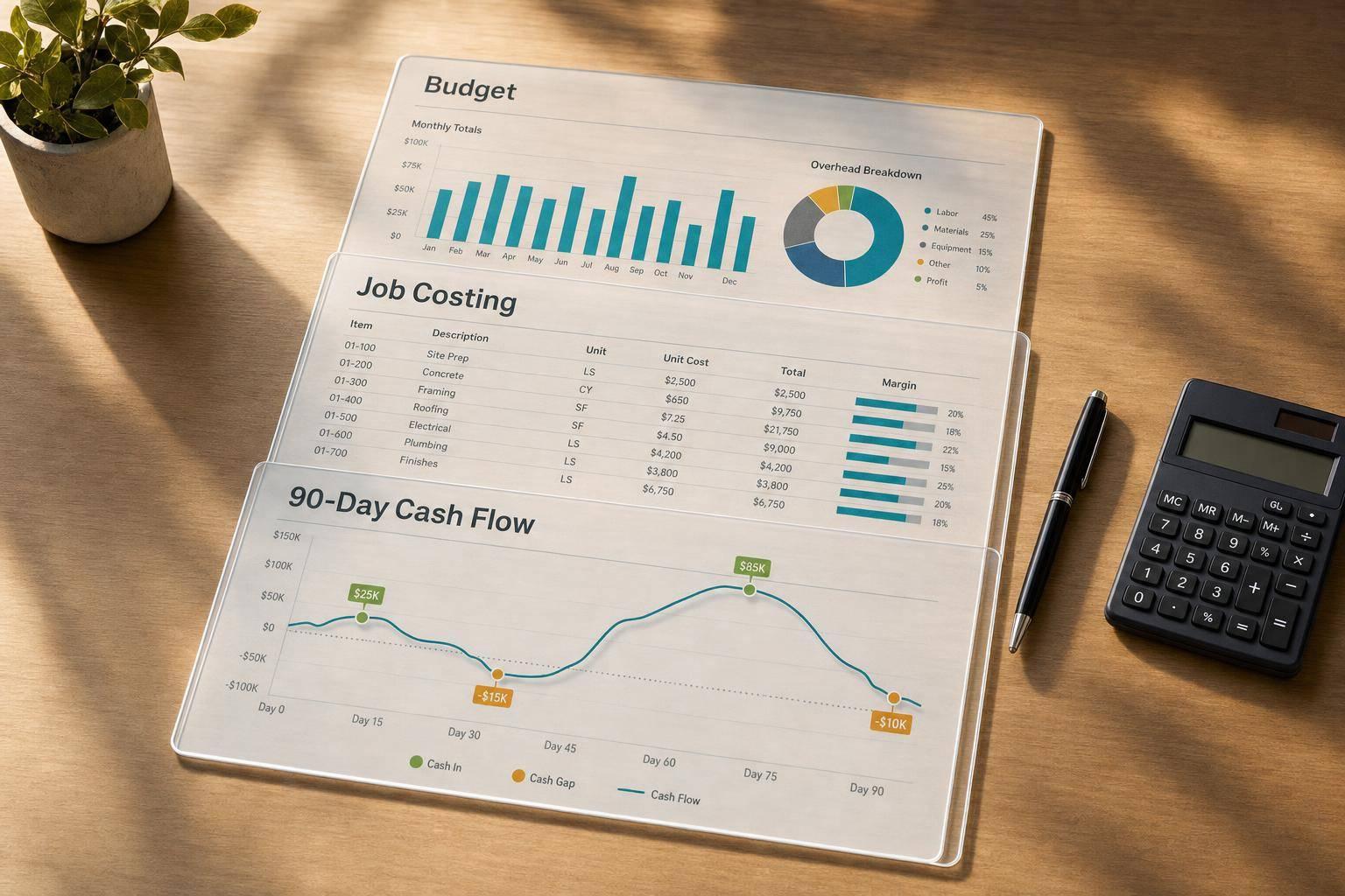
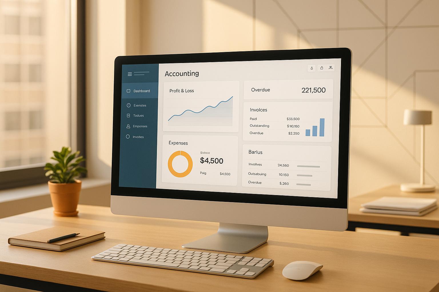
A great dashboard provides instant access to essential metrics without overwhelming the user. The secret lies in a clean visual hierarchy, supported by customizable widgets that make the interface adaptable to different roles within the company.
Customizable widgets allow users to tailor the dashboard to their specific needs. For example, a CFO might focus on cash flow projections and profitability metrics, while a bookkeeper may prioritize transaction accuracy and reconciliation status. This flexibility ensures that everyone gets exactly the information they need without unnecessary clutter.
Visual data representation is another critical element. Charts and graphs help users quickly identify trends and patterns that might otherwise go unnoticed in a spreadsheet. The use of muted base colors with vibrant accents draws attention to important alerts and anomalies, keeping the interface both functional and visually appealing.
The layout itself should avoid high-density areas that can overwhelm users. Information should be evenly distributed, ensuring that critical data is easy to locate. A well-designed dashboard allows users to quickly grasp their financial status without wasting time searching for key details or decoding complex visuals.
Once the dashboard provides clear insights, the next priority is ensuring daily operations remain accurate and efficient.
Transaction management is the backbone of accounting software, and even small improvements in this area can save significant time and reduce costly errors. The challenge is balancing high-volume data entry with the need for precision.
Breaking transaction entry into manageable steps can significantly reduce errors. Instead of overwhelming users with a long, complex form, a step-by-step process with clear instructions ensures that each piece of information is entered correctly. This approach also helps users understand the purpose of each field, minimizing confusion.
Real-time validation is a must-have feature. By flagging issues like duplicate entries, transactions exceeding preset limits, or data that doesn't match expected patterns, the system can catch mistakes as they happen. This immediate feedback allows users to fix errors on the spot, rather than discovering them during reconciliation.
Inline tooltips offer on-the-go assistance without disrupting workflow. Hovering over a field or clicking a help icon should provide concise, relevant explanations about what information is needed and how it impacts financial records. This keeps users focused while ensuring accuracy.
Error messages require special attention. Instead of vague alerts like "Invalid entry", effective messages should clearly explain the issue and guide users toward a solution. Highlighting problematic fields with visual indicators and providing specific instructions can make error resolution far less frustrating.
For repetitive tasks, bulk entry capabilities are essential. Features like importing data, using templates, or duplicating previous entries can save time while maintaining accuracy. However, these tools must include the same validation checks as individual entries to ensure consistency.
After simplifying transaction management, the focus shifts to turning raw data into actionable insights through robust reporting tools.
Effective reporting tools transform raw data into meaningful insights, offering flexibility for various business needs while remaining user-friendly.
Pre-built report templates are a cornerstone of any reporting system. Templates for common reports like profit and loss statements, balance sheets, and cash flow summaries should be readily available. These templates save time, ensure consistency, and provide a reliable starting point for more customized reports.
An intuitive report builder is equally important. Users should be able to customize reports without needing advanced technical skills. Simple dropdown menus, checkboxes, and logical workflows make it easy to select metrics, adjust date ranges, and apply filters. The process should guide users smoothly from report selection to customization and export, avoiding unnecessary complexity.
Clear visualizations help users interpret complex data. Charts, graphs, and tables should present information in a way that highlights trends, outliers, and relationships. Familiar visual formats make it easier for users to connect the data with real-world financial concepts.
Export options should cater to diverse needs. Whether users require polished PDFs for presentations or raw Excel and CSV files for in-depth analysis, the exported data should be ready to use without additional formatting.
For growth-stage companies, comparative analysis tools are invaluable. Users should be able to compare current performance against previous periods, budgets, or different business units with ease. Drill-down features allow users to explore transaction-level details directly from summary reports, helping them investigate anomalies or validate specific results.
Accessibility is another crucial consideration. Reporting tools should comply with accessibility standards, including proper color contrast, keyboard navigation, and screen reader compatibility. These features not only ensure inclusivity but also enhance usability for all users.
| Feature Category | Key Components | Primary Benefit | Implementation Priority |
|---|---|---|---|
| Dashboard Design | Customizable widgets, real-time updates, visual hierarchy | Immediate financial visibility | High |
| Transaction Management | Step-by-step entry, real-time validation, contextual help | Error reduction and efficiency | High |
| Reporting Tools | Pre-built templates, intuitive builder, multiple export formats | Flexible business insights | Medium |
As mentioned earlier, aligning design with user needs and US accounting standards forms the backbone of effective accounting software. The strategies outlined here build on that foundation. Creating user-friendly, compliant software requires teamwork, regular updates, and seamless integration of compliance measures. These practices help growth-stage companies deliver software that truly meets user demands.
Great accounting software is the result of strong collaboration between designers, developers, and financial experts from the very beginning. Each group brings a unique perspective to the table: designers focus on user behavior, developers understand technical limitations, and financial experts ensure accuracy and compliance.
By forming cross-functional teams with clearly defined roles, you can avoid miscommunication and wasted effort. Regular workshops that bring these groups together help everyone align on priorities and constraints. For example, if a designer suggests a simplified invoice process, having a financial expert present ensures the approach still complies with GAAP standards.
To keep everyone on the same page, shared design systems and project management tools are essential. These tools act as a single source of truth for design decisions, technical specs, and business requirements. When changes happen, everyone gets notified immediately, reducing the risk of conflicts during testing.
Take the example of Phoenix Strategy Group. Their model of combining financial advisory expertise with technology teams showcases how collaboration can lead to software that meets both business and regulatory needs [2][3]. Involving financial experts early in the process, not just at the end, prevents costly redesigns when compliance issues arise. Similarly, developers who understand the business context can propose solutions that improve the user experience rather than complicating it.
This kind of collaboration sets the stage for iterative updates that respond to real user needs.
When it comes to improving user experience, small, frequent updates are far more effective than massive, infrequent releases. Iterative updates allow teams to test ideas quickly, gather user feedback, and make adjustments before committing too many resources to a single approach.
Research backs this up, showing that iterative improvements can significantly enhance conversion rates [2].
The key advantage of this approach is that it lets actual user behavior guide design decisions instead of relying on guesses. Feedback loops are crucial for this process. Tools like in-app feedback widgets capture immediate reactions, while analytics platforms reveal how users navigate the software and where they get stuck. Usability testing, on the other hand, provides deeper insights into why certain workflows might feel confusing or inefficient.
For accounting software, it's important to gather input from both financial professionals and other users. A bookkeeper might find a feature helpful, but a CFO could see it as lacking for strategic planning. By involving a diverse range of users, you can ensure updates benefit the entire organization.
Beta testing is another valuable tool. Early adopters often provide detailed feedback that helps refine features before a broader release. Their input can reduce user frustration and support tickets down the line.
Regular stakeholder meetings also play a role in prioritizing feedback. Not every suggestion needs immediate action, but patterns in user input can highlight the most impactful changes. This approach aligns with the integrated strategies used by Phoenix Strategy Group [2].
Building compliance into the software from day one is just as important as collaboration and feedback. US-based accounting software must meet strict regulatory standards, like GAAP, while remaining easy to use. Compliance features should feel intuitive, not like a burden.
For example, clear report labels can help users quickly identify GAAP-compliant documents. Automated alerts for deadlines - such as tax filings or quarterly reports - can keep users on track without requiring them to manually monitor dates. These proactive notifications help prevent costly errors.
Role-based access controls are another key feature. They should protect sensitive data while still feeling natural to users. For instance, accountants and executives need different levels of access, and the interface should adapt accordingly.
Audit trails and activity logs are essential but shouldn’t clutter the main interface. Users should be able to view, export, and share this information easily when needed. A dedicated compliance dashboard can centralize these tools for those who use them frequently.
Data entry forms also deserve special attention. Instead of overwhelming users with long forms, step-by-step processes with clear instructions can improve accuracy. Inline tooltips can explain why certain details are required and how they affect financial records.
Error messages play a big role in maintaining compliance. They should go beyond generic alerts to explain exactly what’s wrong and how to fix it. For example, if a transaction violates GAAP principles, the error message should point out the specific rule and suggest a solution.
Phoenix Strategy Group’s emphasis on GAAP compliance in their services highlights the value of external expertise in meeting regulatory standards. Their systematic approach to data collection and audit trail creation ensures that software supports both compliance and business growth [1].
| Implementation Area | Key Success Factors | Common Pitfalls | Timeline Considerations |
|---|---|---|---|
| Team Collaboration | Cross-functional workshops, shared tools, early expert involvement | Siloed development, late compliance reviews | Ongoing throughout project |
| Iterative Releases | Regular user feedback, beta testing, analytics-driven decisions | Ignoring user patterns, infrequent updates | 2-4 week release cycles |
| Compliance Integration | GAAP adherence, automated alerts, clear audit trails | Treating compliance as afterthought, complex interfaces | Built-in from project start |
Balancing these strategies - collaboration, iterative updates, and compliance integration - creates software that not only meets user needs but also evolves with them. This approach ensures that accounting tools remain effective and aligned with real-world business requirements.
The results are clear: prioritizing user experience (UX) in accounting software is essential for driving business growth and improving operational efficiency. When software is designed with the user in mind, companies benefit from fewer errors and tangible improvements in financial management.
The link between strong UX and positive business outcomes is undeniable. For instance, research shows that enhancing UX can increase conversion rates by as much as 400% for service-based platforms, including accounting software [2]. For growth-stage companies, this often results in better financial management, lower training costs, and more time for strategic priorities instead of dealing with clunky, confusing interfaces.
Effective accounting software UX is built on three main pillars: security and trust, clarity and simplicity, and accessibility and efficiency. These principles are critical for handling sensitive financial data securely. With 67% of fintech users expressing concerns about data privacy, security must remain a top priority in every design decision [6].
A user-centered design approach is what separates functional software from software that truly serves its users. This involves conducting real user research, mapping workflows, and testing prototypes with actual users. The aim is to understand the unique needs of different roles, like bookkeepers versus CFOs, and create interfaces that work seamlessly for both.
Some standout features that enhance UX include real-time dashboards for financial data, transaction management tools with error prevention, and reporting systems that generate standard US financial statements. These features should integrate smoothly into the user's workflow, making the experience feel effortless.
Success in this area depends on several strategies. Cross-functional collaboration between designers, developers, and financial experts ensures that the software meets real-world needs. Iterative development with regular user feedback allows teams to refine features based on actual usage rather than assumptions. Additionally, embedding compliance and auditability into the design from the beginning helps avoid costly revisions later.
The numbers back this approach. For example, a US-based accounting SaaS company that revamped its dashboard and reporting tools saw a 30% drop in user errors and a 25% boost in customer retention [2][5]. These kinds of results show the real-world impact of investing in UX improvements.
Addressing UX gaps is one of the most effective ways for growth-stage companies to improve training efficiency, reduce errors, and enhance financial accuracy. These companies face unique challenges - they need accounting systems that can scale with rapid growth while maintaining compliance and precision. Start by auditing your current software to identify problem areas where users encounter delays, errors, or frustration.
Engaging stakeholders in user research and workflow mapping can uncover the true pain points in your system. This process provides actionable insights into where improvements are needed most.
For businesses ready to take the leap, working with experts can speed up the process. Phoenix Strategy Group specializes in helping growth-stage companies with financial and strategic advisory services, including bookkeeping, fractional CFO support, FP&A, and data engineering. Their expertise in advanced technology and data-driven solutions helps companies implement user-centered accounting systems designed to scale, secure funding, and prepare for exits.
The road ahead involves continuous design refinements, regular user training and support, and a commitment to ongoing improvement. With 64% of US adults using at least one fintech or accounting app, the expectations for user experience are only getting higher [6]. Companies that prioritize thoughtful design will be better equipped to grow, attract funding, and achieve successful exits. The real question isn’t whether to focus on UX - it’s how quickly you can make it happen.
Integrating user feedback into the design of accounting software is essential for building tools that genuinely address user needs. Begin by gathering input through methods like surveys, interviews, or usability testing. This helps uncover pain points and identify features users want most. It’s important to consider feedback from both internal users, such as finance teams, and external users, like clients, to gain a complete understanding of different perspectives.
After collecting feedback, focus on prioritizing updates based on their potential impact and how practical they are to implement. Adopting an iterative design approach allows for continuous updates and improvements. By regularly revisiting and incorporating user feedback, you can ensure your accounting software stays aligned with changing needs while remaining intuitive and effective.
To ensure accounting software meets compliance needs and supports audits right from the start, it's crucial to integrate strong internal controls and comprehensive audit trails during its development. These can include features like automated transaction logs, role-based access permissions, and real-time monitoring to maintain both data security and accuracy.
Another key step is aligning the software with regulatory frameworks such as GAAP or IFRS. This guarantees accurate financial reporting that adheres to required standards. Regular updates to reflect changes in tax laws and reporting rules are equally important. By focusing on these elements, you can design software that not only complies with regulations but also offers clear transparency for auditors.
Focusing on user experience (UX) in accounting software ensures the platform feels intuitive, is simple to navigate, and meets the specific needs of its users. By offering clear workflows, helpful prompts, and easy-to-use interfaces, it minimizes the chances of mistakes like incorrect data entry or misreading financial reports.
Good UX design also boosts productivity by simplifying repetitive tasks, automating tricky calculations, and displaying financial insights in a clear, actionable way. This frees up users to concentrate on more strategic activities, like planning and decision-making, which can lead to stronger financial management overall.