Published on
June 18, 2026


If I want a clean read on product-market fit, I look at retention cohorts first. Signups, MRR growth, and survey scores can look good while churn stays hidden. Cohorts show whether the same customers keep using, paying, and expanding over time.
Here’s the short version:
A flat tail tells me a group of customers keeps getting enough value to stay. A curve that keeps falling toward zero tells me growth may be covering up a product problem.
So when I judge PMF, I don’t ask, “Are we growing?” I ask, “Are the right customers still here 3 to 6 months later?”
Growth can look good on the surface and still hide a churn problem underneath. That’s why retention cohorts matter. They show whether customers stick around after the first spike of activity, instead of lumping everyone into one big number. The goal is simple: separate new demand from retained demand.
Cohorts make it easier to see who keeps coming back and which metrics only seem healthy in aggregate. The main PMF test is straightforward: do customers from the same cohort keep using the product over time?
Aggregate metrics blur that picture. They combine new users, retained users, and churned users into one total, which makes it hard to tell what’s actually going on. A company can post 15% quarterly growth in monthly active users while still losing a big chunk of its base. For example, you might acquire 1,000 new users but lose 500 existing ones at the same time [7].
That kind of topline growth feels good, but it can give you the wrong read on the business. January users may churn fast while March users look strong, and blended averages smooth over that gap. The same thing happens across cohort ages: older, stable cohorts can make retention look fine even when newer cohorts are doing poorly [4].
Once you can see churn clearly, the money side gets a lot clearer too. If retention slips, customer acquisition gets more expensive, LTV drops, and runway gets shorter. At that point, acquisition isn’t adding much net growth. It’s just replacing the customers who left.
Weak retention also stretches payback periods, pushes up effective CAC, and drives LTV:CAC lower than the topline numbers suggest. That’s where aggregate MRR forecasts can get dangerous. If they ignore cohort decay, they can paint a far better picture of runway than the company actually has.
In one documented case, a startup’s 16-month runway forecast was revised down to 11 months after a cohort-accurate decay curve was applied [8].
There’s also a PMF issue here. If the retention curve never flattens, growth can create false confidence instead of showing durable product-market fit. Investors often dig into the underlying cohort data, and if that flat tail is missing, valuations or fundraising outcomes can take a hit [4].
If you want a sharper read on PMF, don't stop at top-line growth. Look at cohort behavior.
Retention cohorts group customers by the date they started, then track whether they keep using or paying for the product over time. That setup shows whether people got value once or whether the product keeps delivering it.
One detail matters a lot here: define "active" based on a real value event, not something weak like a login. The better test is whether users completed a core value-exchange action, such as created a task, sent a message, or saved a document.[3]
The best retention metric depends on the kind of value your product delivers.
| Metric | What It Measures | PMF Signal |
|---|---|---|
| Logo Retention | % of original customers still paying | High stability suggests strong product stickiness [4][9] |
| Engagement Retention | % of users performing a core value action | A flattening curve shows users have formed a habit [1] |
| Gross Revenue Retention (GRR) | % of original revenue retained, excluding expansion | A high GRR shows the core value proposition is holding [9] |
| Net Revenue Retention (NRR) | % of original revenue retained, including expansion | NRR above 100% means customers are paying more over time [5][6] |
After you pick the metric, the shape of the curve matters more than any single data point.
A healthy retention curve usually drops at first and then starts to level off. That flat tail is the signal you want. It means a core group of users found lasting value and kept coming back. If the curve keeps sliding toward zero, the product still isn't part of anyone's routine in a steady way.[1][4]
Early retention can fool you. Sometimes it's just a honeymoon phase, not PMF. That's why it's smart to wait until M3 and M6 before making the call.[9]
"A retention curve that doesn't flatten is a business that doesn't have a defensible base." - Dr. Kevin Nguyen, Head of Finance & Research [4]
Company-wide averages can blur what's actually happening.
A product might retain 55% of users from organic search, while only 8% of paid-acquisition users stick around. Blend those together, and the average can make the whole picture look middle-of-the-road.[5][3]
That's why it helps to break cohorts out by things like:
This is often where PMF first shows up. It may exist in one slice of your user base well before it shows up across the full product.
Superhuman is a good example. In 2017, its aggregate Sean Ellis score was 22%, far below the 40% PMF threshold. But when founder Rahul Vohra segmented the data, "busy professionals" scored 58%. Superhuman then focused ONLY on that segment, pushed its aggregate score above 40%, and found durable PMF.[9]
The point is simple: segment-level cohorts show you where fit already exists.
The next step is turning those patterns into decisions on pricing, product, and scale. For many startups, navigating these strategic shifts is a core benefit of fractional CFO services.
Once you know what a healthy curve looks like, the next step is simple: build your cohort model so it measures the same value event every time. That keeps the read clean. If the event changes from one cohort to another, the chart gets noisy fast.
The cohort type you pick changes what you can learn from the data. Signup cohorts are best for activation. They show whether people get through onboarding and find value early. First-payment cohorts look at users who made an actual financial commitment, which makes them more useful for SaaS unit economics. Acquisition channel cohorts help you separate high-intent organic fit from paid campaign noise. And plan tier or segment cohorts can show that PMF exists in one part of your customer base even if retention is weak somewhere else. [3][8][4]
| Cohort Definition | Best Use Case | PMF Signal |
|---|---|---|
| Signup | Onboarding & activation | High early drop-off signals poor activation [3][8] |
| First-Payment | Financial PMF & unit economics | Flat tail indicates a stable, paying base [8][4] |
| Acquisition Channel | Marketing efficiency | Separates organic fit from paid noise [3][8] |
| Plan Tier / Segment | ICP validation | Shows where fit exists before it appears company-wide [8][4] |
Your time bucket should also match normal customer behavior. Weekly cohorts make sense for most B2C SaaS and productivity tools. Monthly cohorts fit enterprise SaaS or e-commerce with longer buying cycles. Daily cohorts are better for high-frequency products like games, social platforms, and news. [3]
In plain English, your cohort setup should match the decision in front of you. Are you judging activation, revenue quality, channel quality, or segment fit? Start there.
At a minimum, track customer ID, cohort start date, period status, and revenue per period. [8] Then make sure the event you measure is tied to actual customer value, not surface-level activity.
Logins and page views can look busy without telling you much. A stronger signal is the action that shows the product did its job, like "created a report", "updated a task", or "contacted a supplier." [3] That’s the event that belongs in your retention model.
There’s also a simple gut check here: compare retained users with churned users. The gap between those two groups often points straight to your core value loop, meaning the actions that drive stickiness. [5]
When that event is set up the right way, cohort retention gives you a much cleaner read on whether customers found lasting value.
Cohort data shouldn’t sit in a dashboard and collect dust. It should feed straight into your financial model. It gives you a more grounded view of LTV assumptions and NRR expectations. A flat first-payment tail supports a defensible LTV assumption, and that LTV - combined with gross margin - helps set a rational CAC ceiling. [8]
NRR should line up with what your cohort retention curves are showing. When you bring that number into recurring KPI reviews, retention stops being a side metric and starts shaping growth projections directly. [8]
That makes the next move much clearer: which segments need work, which ones deserve more budget, and which ones you should stop funding.
Retention Cohort Patterns & What They Mean for Product-Market Fit
Once you’ve built the cohort curve, the job shifts from reading the chart to doing something with it.
Retention curves don’t just tell you if PMF is weak. They often point to which PMF problem is getting in the way. And each shape tends to hint at a different cause.
The pattern usually tells you where to look first.
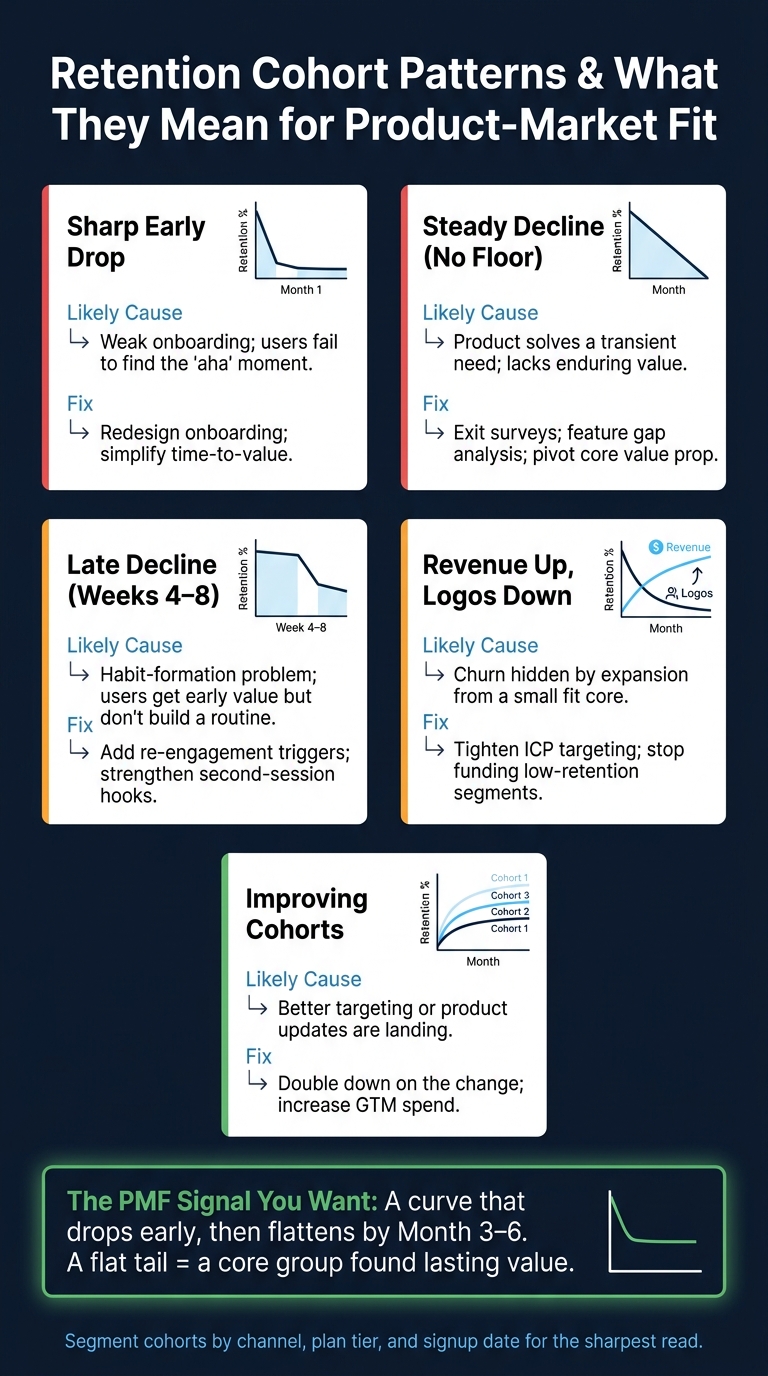
| Cohort Pattern | Likely Cause | Recommended Response |
|---|---|---|
| Sharp early drop (Month 1 drop, then flattens) | Weak onboarding; trial-to-paid mismatch; users fail to find the "aha" moment [4][2] | Redesign onboarding; improve qualification of leads; simplify time-to-value [2][5] |
| Steady decline (No floor) | Lack of enduring value; the product is a novelty or solves a transient need [4][2] | Conduct exit surveys; perform feature gap analysis; pivot core value proposition [2] |
| Late decline (Drop in weeks 4–8) | Habit-formation problem; users get early value but don't build a habit [3] | Add re-engagement triggers; strengthen second-session hooks [3] |
| Revenue up, logos down | Acquiring unfit customers while expanding a small, fit core [4] | Tighten ICP targeting; stop investing in low-retention segments [4][5] |
| Improving cohorts | Better targeting or product updates are landing [1][4] | Double down on the change; increase GTM spend [1][2] |
One pattern deserves extra caution: High Dollar / Low Logo. That means revenue is going up while logo retention trails behind. On paper, that can look fine. In practice, it often means churn is being covered up by expansion from a small group of customers that do fit.
That’s not a base you want to scale from. It’s a sign to tighten your ICP before putting more money into acquisition.
Once you know the problem, the next call is simple in theory and hard in practice: fix, narrow, or scale.
A flat tail is your sign that it may be time to test scale. Not after one decent month. Not after one better-looking cohort. You want to see that flat tail show up across several periods before adding acquisition budget or hiring ahead.
Scale only after the curve flattens across multiple periods.
If your cohorts are still sliding with no floor, more spend won’t solve it. It just pours more leads into a leaky bucket. The better move is to narrow your ICP, fix activation, and wait until the curve settles before scaling hard.
Aggregate retention can blur what’s going on. Cohort retention shows whether the customers you brought in last quarter are still here, and whether this quarter’s customers are doing better or worse.
Segmented cohorts make the picture even sharper. They show where to put budget, product time, and sales focus. That’s the point: retention cohorts turn PMF from a claim into something you can actually run the business on.
A retention cohort is a group of users who share the same starting point, usually the week or month they first signed up or began using a product.
Instead of lumping everyone into one big data set, cohort analysis follows each group over time. That makes patterns much easier to see. You can tell whether the share of active users starts to flatten out over time, which is a key sign of product-market fit.
Wait until you have at least four weeks of cohort data. But don’t get too hung up on the calendar. The bigger thing to watch is your retention curve.
A strong signal shows up when the curve flattens. That means week-over-week retention change is close to zero for three or more weeks in a row. If the curve then stays steady at or above your industry benchmark, you’ve likely reached product-market fit.
Track cohort-based retention first. Aggregate retention can blur what’s going on, but cohorts grouped by signup week or month let you see how each segment sticks around over time. That gives you the clearest signal of product-market fit.
Focus on the shape of the retention curve, not just a single percentage. If the curve levels off after an early drop, you likely have a stable base of users who are getting value from the product. If it keeps sliding toward zero, you don’t.