Published on
June 6, 2026

Poorly designed KPIs in FP&A can cost companies millions. Misaligned metrics, over-reliance on lagging indicators, and tracking too many or irrelevant KPIs are common mistakes that hinder decision-making and growth. This guide highlights seven major pitfalls and provides actionable solutions to optimize your KPI framework.
The bottom line? Effective KPIs are actionable, focused, and tied to decisions. Without this, even the best dashboards fail to deliver results.
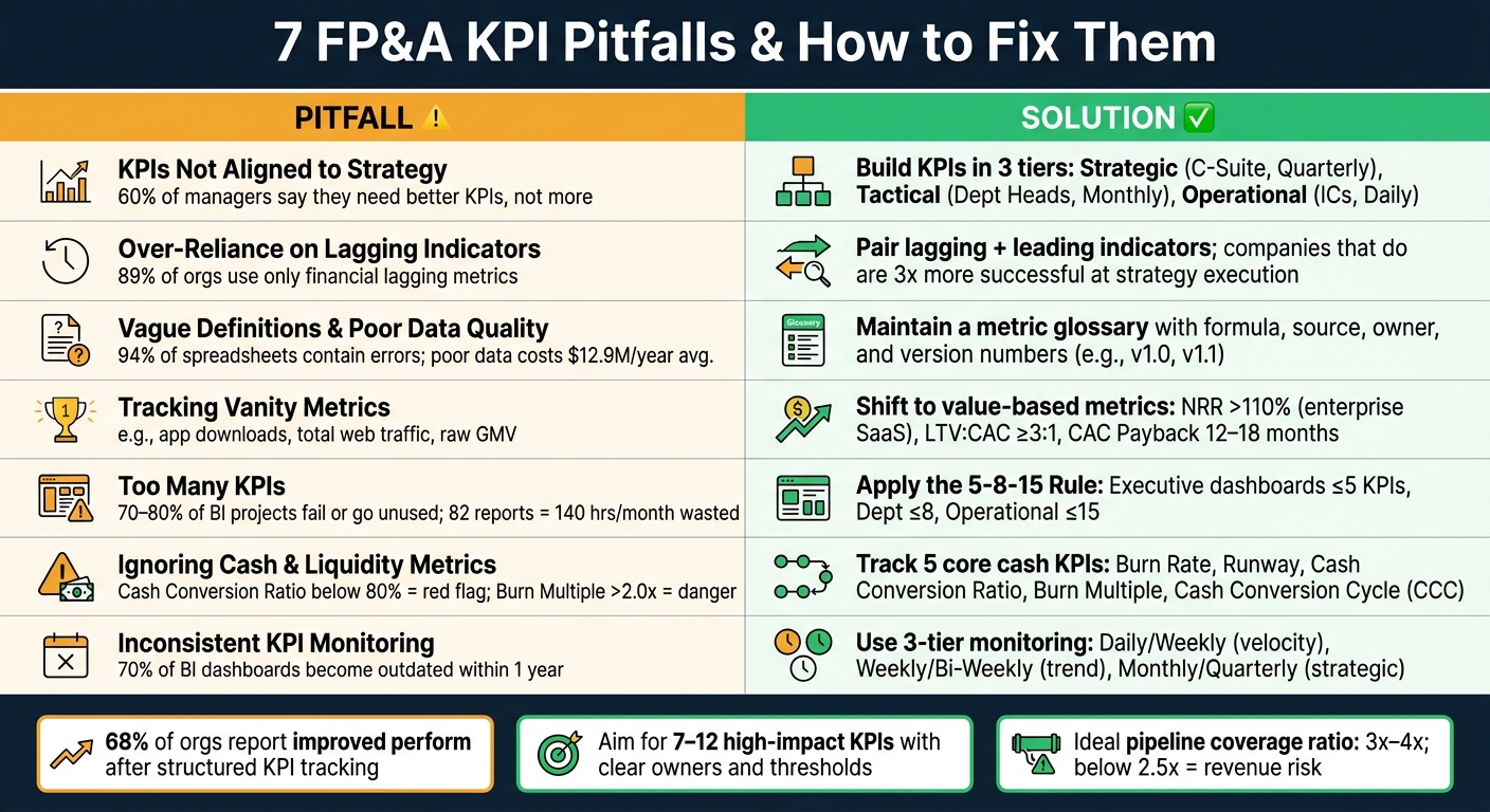
7 FP&A KPI Pitfalls: Common Mistakes vs. Best Practices
When KPIs fail to align with core business objectives, teams can end up chasing metrics that work against profitability. For instance, sales teams focused solely on top-line revenue might close low-margin deals, while product teams concentrating on feature counts could overlook early signs of customer churn. Both scenarios can lead to stagnant growth.
The value of a KPI lies in the decisions it informs. As Modelcom aptly states:
"A KPI is strategic if it directly influences a decision, highlights a risk, supports planning, or guides resource allocation." [5]
The numbers tell the story: 60% of managers say they need better KPIs, not just more of them [2]. Often, FP&A teams rely on dashboards built around easily accessible ERP data rather than focusing on the critical questions leadership needs answered. This creates a gap between what finance tracks and what the business truly needs to achieve its goals.
Strategic KPIs should connect financial outcomes - like revenue growth or gross margin - to the operational drivers behind them, such as pricing strategies, pipeline quality, or customer retention. Without this connection, KPIs fail to prompt meaningful action. This disconnect underscores the importance of a structured approach to create KPIs that directly support strategic decision-making.
The best way to create effective KPIs is to start with the decisions they need to support, not the data available. Begin by identifying the specific business question each KPI should address. From there, structure KPIs across three levels:
| KPI Tier | Audience | Focus | Cadence |
|---|---|---|---|
| Tier 1: Strategic | C-Suite / Board | Overall health & long-term goals | Quarterly / Monthly |
| Tier 2: Tactical | Department Heads | Function-specific performance | Monthly / Weekly |
| Tier 3: Operational | Individual Contributors | Granular, short-term activities | Weekly / Daily |
This tiered structure ensures that daily activities are aligned with long-term goals. To strengthen this alignment, assign ownership of each KPI to a specific individual responsible for interpreting the data and taking action. Additionally, use "Red/Amber/Green" thresholds to clearly indicate when action is needed. These steps turn KPIs from static metrics into tools that drive dynamic, informed decision-making.
Many FP&A dashboards focus heavily on lagging indicators - metrics like revenue, net income, EBITDA, and cash position. While these provide a clear picture of past performance, they often signal problems too late to take effective action.
"A dashboard composed entirely of lagging indicators is a rear-view mirror. By the time a lagging indicator deteriorates, the window for corrective action has already narrowed." - CFO Upgrade [2]
This overemphasis on outcome-based metrics creates a blind spot. A striking 89% of organizations rely solely on financial lagging indicators, whereas only 11% manage to balance them with forward-looking metrics [2]. The impact is clear: companies that integrate both leading and lagging indicators are three times more successful at implementing strategies than those that don't [8].
Lagging indicators reflect past results - they tell you what has already happened. In contrast, leading indicators provide insight into future trends, offering a chance to act before issues materialize.
| Metric Type | Purpose | Examples |
|---|---|---|
| Lagging | Confirm outcomes | Historical revenue, net income, cash position |
| Leading | Predict future trends | Sales pipeline value, order backlog, churn signals |
The distinction between these two types of metrics is critical. For example, a "green" revenue figure might look reassuring, but it could be hiding a declining sales pipeline or rising customer churn. Ignoring these operational signals can lead to unpleasant surprises down the road.
To avoid this pitfall, pair lagging indicators with complementary leading metrics. For instance:
This approach provides early warnings, allowing leadership to address potential problems before they escalate. For growth-stage companies, a healthy pipeline coverage ratio typically falls between 3x and 4x. If it drops below 2.5x with eight weeks left in the quarter, that's a clear signal of a potential revenue shortfall, giving teams enough time to respond [9].
"Leading indicators (pipeline coverage, forecast accuracy, budget variance) predict financial outcomes 30 to 90 days before they appear in reported results." - Siddharth Gangal, Founder, Fairview [9]
To make these metrics actionable, establish "Red/Amber/Green" thresholds for each leading indicator. Breaching a threshold should trigger an immediate, predefined response, ensuring the organization stays ahead of potential risks.
Even with a well-thought-out mix of leading and lagging indicators, things can still fall apart if your KPI definitions are unclear. Imagine two teams calculating the same metric differently - one counting contracted ARR and the other focusing on recognized revenue. Instead of productive business discussions during monthly reviews, you could end up in endless debates over calculation methods. This inconsistency can seriously undermine decision-making.
The numbers tell the story: 94% of spreadsheets used for business decisions contain errors [1], and poor data quality costs companies an average of $12.9 million annually [3]. Inconsistent metrics can waste a leadership team’s time and money - nearly $225,000 each year for a six-person team focused on reconciling conflicting data [13].
"One wrong number destroys all trust in the dashboard. After a single discrepancy is discovered, users default to 'is the dashboard right?' instead of 'what does the dashboard tell me?'" - BPR Global [3]
When metric definitions are unclear, trust in data erodes, and actionable insights become harder to achieve. The problem often lies in the lack of agreement on what a metric means. Take the term "active customers", for example. Does it include trial users? What about customers on payment plans who are 30 days overdue? Without clear rules, each team interprets it differently, creating multiple conflicting "truths."
A simple solution? Maintain a metric glossary - a well-documented data dictionary for every KPI. This should include the calculation formula, data source, refresh frequency, exclusions, and the assigned business owner. A good rule of thumb is to ask: Can two people independently calculate this metric and get the same result? If the answer is no, the metric isn’t ready for executive-level decisions [10]. Any metric producing inconsistent results should be flagged and clarified [10].
KPI definitions can also "drift" over time as new sales channels, regional expansions, or dashboard tweaks creep in. This makes historical comparisons tricky. To avoid this, think of KPI definitions like software - release them with version numbers (e.g., v1.0, v1.1) and document their effective dates. This approach preserves the integrity of your data over time [4].
Once you’ve nailed down consistent definitions, the next step is centralizing your metric logic. Instead of letting Sales, Marketing, and Finance teams create their own calculations in separate spreadsheets, move the logic into a shared data warehouse or semantic layer. This ensures everyone is working with the same math [12]. The goal isn’t to jam everything into one system but to assign a specific system of record for each metric - for instance, use the ERP for recognized revenue, the CRM for pipeline data, and the HRIS for headcount costs [11].
Phoenix Strategy Group tackles this issue by syncing real-time financial data directly into a company’s reporting stack. By doing this, they eliminate the patchwork spreadsheet model that’s a common culprit behind data quality problems in growing companies.
"Metric mapping drift happens when a KPI keeps the same name but quietly changes meaning as it moves between ad platforms, analytics, spreadsheets, BI, and CRM systems." - Morgan Anders, The Startup Dispatch [11]
Accountability is key. Assign a specific owner to each metric to ensure it stays updated when definitions change.
"A KPI without an owner is a number without consequence." - CFO Upgrade [2]
Having clean data and clear definitions won’t save your dashboard if it’s loaded with vanity metrics - numbers that look impressive but fail to inform decisions.
"The metrics were 'green' on the dashboard, but the bank account was red. This is the Universal Dashboard Paradox." - Kudwa [14]
Vanity metrics are flashy but don’t drive action. Think app downloads, total web traffic, headcount, or raw pipeline volume ($). These numbers highlight activity, not impact. Here’s a simple test: ask yourself if a 10% change in that metric would influence a specific business decision. If the answer is no, it’s likely a vanity metric [15].
A more subtle issue is context collapse. Even seemingly critical metrics like total ARR can fall into this trap. For example, 8% monthly ARR growth might look great - until you uncover it’s hiding rising churn or a 90-day gap in pipeline visibility [7]. Seth Girsky, Founder of Inflection CFO, explains:
"A metric without context is just a number. And a number without narrative is a blind spot disguised as insight." [7]
Marketplace and platform businesses are particularly at risk. Gross Merchandise Value (GMV) is a classic example - it can grow while net revenue remains stagnant. A more telling metric is the take rate (net revenue ÷ GMV), which reveals what the business actually retains [14].
To avoid being misled, focus on metrics that directly reflect business impact. Replace surface-level indicators with ones that clearly tie to financial outcomes.
The solution isn’t adding more metrics - it’s choosing the right ones. Research shows 60% of managers need better KPIs [2]. The goal is to move from output metrics to outcome metrics that directly link to financial health and enterprise value.
| Vanity Metric | Value-Based Metric |
|---|---|
| App Downloads / Total Users | Net Revenue Retention (NRR), Churn by Cohort |
| Total Pipeline Volume ($) | Pipeline Velocity, Pipeline Coverage Ratio |
| GMV or Bookings | Net Revenue, Burn Multiple |
| Web Traffic and Ad Impressions | CAC (Fully Burdened), Pipeline Sourced |
Here are some benchmarks to keep in mind: a LTV:CAC ratio of 3:1 or higher signals healthy growth - anything below 2.5:1 suggests you’re losing equity value with each new customer [9]. For SaaS companies, CAC payback should fall between 12 and 18 months; if it stretches beyond 24 months, it’s a red flag [9]. And for enterprise B2B SaaS, a Net Revenue Retention above 110% indicates that expansion revenue is outpacing churn [14].
"If a KPI does not prompt action when it moves, it does not deserve KPI status." - Martin Duben, Founder, Onetribe [2]
Phoenix Strategy Group works with growth-stage companies to replace activity-driven metrics with actionable ones like burn multiple, NRR, and gross margin - metrics that directly support funding and exit strategies.
After tackling vanity metrics, another common mistake is overwhelming dashboards with an excessive number of KPIs. More metrics don't necessarily lead to better insights. In fact, a dashboard packed with 30–50 KPIs spreads focus too thin, leaving none of them with the attention they deserve. Bernard Marr, a well-known KPI expert, explains:
"Having too many KPIs is almost as bad as having none. Companies should aim for 10–15 strategic KPIs, not 50–100. The more KPIs you have, the less attention each gets." [3]
The issue isn't just about distraction - it comes with a hidden cost. Gartner highlights that 70–80% of BI projects fail or go unused [3]. For example, one FP&A team discovered that maintaining 82 low-impact reports consumed 140 hours per month - essentially the workload of a full-time employee [16]. That time could have been better spent on activities like analysis, forecasting, or making critical decisions.
The best place to start isn't with the data itself - it's with the decisions you need to make. Ask yourself: What specific business decisions does this metric support? If a metric doesn’t directly inform a decision, it’s better left out.
A handy tool for this is the "Kaushik Test", which asks: "Does a change in this number trigger a clear action?" If the answer is no, the metric is just noise [3]. This aligns with Ansh Timbadia's advice from Practus:
"Fewer, decisively chosen metrics are the goal." [17]
To refine your KPI list further, each metric should meet five criteria: it must link to a specific decision, be consistently calculable by different people, have a named owner, include a defined action threshold, and follow a set review schedule [2]. Metrics failing more than one of these tests should be reconsidered or removed.
After identifying the most impactful KPIs, structure them thoughtfully. Follow the 5-8-15 Rule:
This rule is based on the cognitive principle that human working memory can only handle 5 to 9 pieces of information at a time before decision-making suffers [3]. Every KPI you include should inspire action - too many metrics will dilute this purpose.
Organize your scorecard into three tiers, tailored to the audience and review frequency:
| Dashboard Type | Primary Audience | Key Question | Review Cadence |
|---|---|---|---|
| Strategic | CEO, CFO, Board | Are we on track strategically? | Monthly/Quarterly |
| Analytical | FP&A, BU Heads | Why are we off track and by how much? | Monthly |
| Operational | Sales Ops, Treasury | What needs my attention right now? | Daily/Weekly |
The goal is to design top-level dashboards that let anyone assess the business's overall health within five seconds. Deeper, diagnostic details should only be available one level down, ensuring the primary view remains uncluttered. This principle mirrors the Monday Morning Metrics framework from Phoenix Strategy Group: a concise, executive-level summary that highlights only actionable signals, while offering more detailed analysis for teams that require it.
Neglecting cash metrics is a common mistake that can leave growth-stage companies vulnerable. While revenue and profitability are often the focus, ignoring cash reserves can lead to serious trouble. Why? Because profit is an accounting concept, while cash reflects the actual money available to keep the business running - and the gap between the two can be risky. Let’s dive into key cash and liquidity metrics that help safeguard fast-growing companies.
During periods of rapid growth, cash flow mismatches often grow wider. Upfront costs, like hiring sales teams or acquiring customers, can outpace the cash coming in. Even if a company’s monthly burn rate seems steady, its cash runway - the time left before cash runs out - can shrink alarmingly fast [19].
This is why investors pay close attention to cash flow during due diligence. A Cash Conversion Ratio below 80% is a red flag, signaling that cash flow isn’t keeping up with profits. Similarly, a burn multiple (net cash burned ÷ net new ARR) above 2.0x indicates that growth is draining capital too quickly [9].
To stay on top of cash health, track metrics like burn rate, runway, Cash Conversion Ratio, burn multiple, and the Cash Conversion Cycle (CCC). These metrics fall into three main areas: burn, liquidity, and conversion efficiency. Let’s break them down:
"Runway is the only metric on the dashboard with a hard floor - when it reaches zero, no other metric matters." [9]
For Series A–B companies, a runway below 12 months should trigger an immediate review of spending and fundraising plans [9].
Here’s a quick overview of these key KPIs:
| Cash KPI | What It Measures | Why It Matters |
|---|---|---|
| Burn Rate | Rate of cash consumption | Indicates how fast reserves are being depleted |
| Runway | Months of cash remaining | Crucial for timing fundraising efforts |
| Cash Conversion Ratio | Operating Cash Flow ÷ Net Income | Highlights gaps between profits and cash; below 80% warns of issues |
| Burn Multiple | Net cash burned ÷ net new ARR | Shows if growth is consuming cash too aggressively |
| Cash Conversion Cycle | DSO + Inventory Days − DPO | Tracks how long cash is locked in operations |
It’s not enough to understand these metrics - you also need to see how your operations influence them. Ignoring these connections can undermine strategic decisions.
For example, Days Sales Outstanding (DSO) is a key early warning sign. If DSO rises by five or more days while revenue grows, it can disrupt the cash conversion cycle [19]. Plus, accounts receivable older than 90 days have only a 10–30% chance of being collected, so a growing receivables balance may overstate actual cash [20].
On the other hand, Days Payables Outstanding (DPO) tracks how long the company takes to pay its suppliers. Delaying payments might temporarily boost cash on hand, but it can also cause issues with free cash flow later on [21]. Inventory management plays a similar role, reflecting how efficiently cash is being turned into revenue.
To address these challenges, consider creating a three-layer forecast. This should include accrual revenue, actual cash revenue, and working capital needs [19]. When paired with tools like Phoenix Strategy Group’s cash flow forecasting systems, this approach gives growth-stage teams the clarity needed to spot liquidity risks before they spiral into crises.
Even the most well-thought-out KPIs lose their effectiveness if they’re not reviewed regularly. Without a consistent schedule for monitoring, small variances can go unnoticed, leading to bigger problems that only become apparent when they show up on the profit and loss statement. The issue here isn’t the quality of the data - it’s the lack of discipline in reviewing it. This makes a structured review process absolutely essential.
Here’s a telling statistic: 89% of companies rely solely on financial lagging indicators, which only highlight problems after the damage has already been done [2]. On top of that, about 70% of BI dashboards become outdated within a year if there’s no formal review system in place [3].
"KPI lag kills strategic adaptability. When indicators aren't live, decisions aren't either." – Hurree [6]
To stay ahead of potential issues, monitoring should be divided into three distinct tiers:
| Timing Tier | Frequency | Example Metrics | Purpose |
|---|---|---|---|
| Velocity | Daily / Weekly | Cash position, burn rate, daily sign-ups | Provides early warnings and allows for quick interventions [23] |
| Trend | Weekly / Bi-Weekly | CAC, churn cohorts, MRR growth | Identifies directional changes before they escalate [23] |
| Strategic | Monthly / Quarterly | LTV, revenue per employee, market expansion ROI | Guides long-term strategies and board-level decisions [23] |
This type of schedule ensures that problems are caught early, giving you the chance to act before they spiral out of control. A key rule to follow is the intervention window rule: your monitoring frequency should always be shorter than the time you have to respond to a negative trend. For instance, if your cash runway is at risk of running out in 30 days, a monthly review won’t cut it.
A helpful tool for staying on top of metrics is the use of weekly “flash reports.” These are short, automated summaries that keep leadership updated between formal monthly closes [18][23]. Phoenix Strategy Group, for example, uses this method to help growth-stage companies stay proactive about potential variances.
As discussed in earlier pitfalls, consistent monitoring transforms KPIs from static numbers into actionable tools. But even the best monitoring schedule is meaningless if it doesn’t lead to action. Avinash Kaushik, Digital Marketing Evangelist at Google, puts it perfectly:
"If this metric changes, do I know what action to take? If the answer is no, the metric does not belong on a decision dashboard." [3]
Every KPI should have a clear owner and predefined thresholds - red, amber, and green - to signal when action is needed [2][3]. Without these, monitoring becomes a passive exercise rather than an active management tool.
To keep your metrics relevant and reliable, consider implementing a monthly 30–45 minute review session. This structured meeting can help ensure that KPI definitions are still accurate, flag any metrics that may have drifted due to system changes, and confirm that thresholds align with current business realities [4]. This small time investment can prevent dashboards from becoming outdated or misleading over time.
This guide has explored common pitfalls that weaken the effectiveness of KPIs in FP&A. Issues like misaligned strategies or inconsistent monitoring can disrupt the connection between tracking performance and making informed decisions. And that disruption can be costly. In fact, 68% of organizations report improved performance after adopting structured KPI tracking systems [2].
The secret isn’t in tracking more data but in tracking the right data. According to research from BCG and MIT, 60% of managers believe they need better KPIs, not an overwhelming number of them [2]. The goal should be a manageable set of 7–12 high-impact metrics, each with a clear definition, a responsible owner, specific thresholds (green/amber/red), and a review schedule that aligns with your business’s pace.
"Fifty indicators with no priority is worse than seven with clear purpose." – Martin Duben, Founder, Onetribe [2]
For growth-stage companies, creating this framework isn’t easy. Data is often scattered across multiple systems, definitions can change over time, and leadership teams are stretched thin. That’s where specialized FP&A support can make a real difference. Phoenix Strategy Group works with growth-stage businesses to build reporting systems and establish data governance practices that link measurement directly to decision-making. This approach transforms scattered data into actionable insights [2]. For a deeper look at how these experts drive value, see our guide to fractional CFO services.
Start by identifying the key business decisions that drive your strategy - don’t just rely on the data already at hand. Narrow your focus to 5–7 metrics that directly support your goals and trigger action when they shift. Each KPI should be clearly defined, assigned to a specific owner, and linked to an operational driver that influences outcomes. Phoenix Strategy Group specializes in aligning financial metrics with your priorities, transforming dashboards into practical tools that support growth and informed decision-making.
To move past reactive reporting, combine lagging financial results with forward-looking indicators to gain earlier insights. For revenue, pair metrics like monthly recurring revenue with pipeline velocity, churn rates, and customer acquisition costs. When it comes to cash, include factors such as days sales outstanding, days inventory outstanding, and the cash conversion cycle. Tying these metrics to your financial models allows you to project future performance instead of merely analyzing past outcomes.
To address inconsistent KPI definitions and data issues efficiently, swap out manual tracking methods for a well-structured metric system. Create a one-page metric charter that clearly outlines standardized, non-negotiable definitions for every key KPI. This should include details like how each metric is calculated and the specific data sources used.
Assign one dedicated owner to each metric. Align all KPIs with financial statements, and rely on a centralized semantic layer to maintain consistency across reports. This approach eliminates disputes over methodologies and ensures everyone is working with the same numbers.